Ecommerce accounted for 16% of total retail sales in the United States in 2019, and online shopping is only set to grow in 2020 and beyond. Retailers who aren’t fully omnichannel are vulnerable to being left behind—customers desiring to choose how they shop with you is the new normal, and that’s been particularly accelerated by stay-at-home measures.
Clearly, then, a retailer looking to strengthen their business in the long-term should look to launching an online store to complement in-store sales.
But poor website design can lead to less-than-desirable end results: lost sales due to a complicated, fractured or poorly-organized website design.
Luckily, though, you don’t need to know how to code to have a functional, beautifully-designed online store that customers love. Ecommerce hosting platforms often have curated theme stores with a selection of high-quality and customizable pre-made themes.
Still, though, the question remains: how do you select the best website theme for your store? In this post, you’ll learn how to pick the right theme for your business by reviewing:
Let’s dive right in!
Learn how to bring your retail business online
Becoming an omnichannel business means you’re ready for whatever life throws at you—from extended store closures to evolving customer expectations. Learn how to bring your products online and start selling fast with our free quickstart guide.
Website theme essentials
No matter what sell you and who you sell it to, there are several things your website theme needs:
- Basic eCommerce functions, such as a shopping cart: you’re not starting a blog, after all! (Though having blogging capabilities built into your eCommerce website theme may be important for you—more on that later.)
- Desktop and mobile responsiveness: purchases on mobile devices made up more than a quarter of all online sales in 2019. Be sure that your website theme is optimized to support both desktop and mobile browsing experiences.
- An easily understandable navigation system:if your product categories are hard to navigate, they’ll be hard to shop from. If you need more than a few seconds to understand how a theme’s navigation works, move onto another theme. Ideally, your website’s nav bar reflects your inventory classification system.
- Fast load times:a well-designed but slow theme will turn customers away. Look for one that loads quickly on both desktop and mobile. Be sure to test your site speed and test that it loads pages as fast as possible. Google recommends load time be under 3 seconds.
- Google fonts integration:you want to be able to pick a font that displays properly on your customers’ devices and doesn’t add extra loading time, after all.
- Search bar:customers that can’t find what they’re looking for will have a much harder time making a purchase without a search bar.
- Locations: it should be easy for your customers to find the addresses and opening hours of your locations so they can consider visiting you in person. This information should be always up-to-date–an eCom platform that automatically syncs your hours from your Retail POS, like Lightspeed, will help you keep on top of that.
If a website supports the above features, you’ll have a perfectly functional shopping experience. You can find dozens of customizable website themes that check all these boxes in Lightspeed eCom’s theme store.
Going beyond the basics
To truly narrow down the best website theme for your store, take the time to answer these three questions.
1. How are other stores in your niche catering to their customers?
Let’s imagine, for a moment, a jewelry retailer who takes their website theme design cues from a hardware store—there’s a strong chance that’d look out of place, right?
Sure, clever branding could definitely pull it off, but being the Home Hardware of engagement rings is pretty niche. You probably want to evoke a different sort of feeling for your jewelry store, so your website design should reflect that.
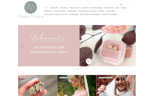
Lightspeed customer Atelier Maison’s website theme evokes romantic spring wedding feelings.
The best way to educate yourself on how to evoke the specific feelings and impulses you want your customers to feel is to look at what others in your space are doing. If you’re looking to take your home goods store online, for example, start visiting the websites of your home goods competitors and the big names in your industry.
Make a list of the features you see on these sites, and make a note any time that feature shows up on multiple sites. As you do this, try to look beyond the colors and fonts, as you generally have free reign to customize those.
Your list might look like this:
- Frontpage slideshow
- Featured products with descriptions
- Daily deal timers
- Horizontal menu bars
- Live wishlists
- Newsletter popups
- Live chat
- Product pages with collapsible menus
- Personalized product recommendations
2. What impressions do I want my website theme to make?
Take your list and review the features. Try writing out why you think the sites you browsed used these features. Imagine you’re a customer visiting your site for the first time. What would each of these features make you feel?
For example, we wrote down daily deal timers on our list. If we’re running a high-end home goods store, that feature may look out-of-place—so we don’t need it for our site, and it won’t be an important feature on the website themes we consider.
Meanwhile, having a frontpage slideshow may be perfect for displaying products in a way a static header can’t. Our hypothetical high-end home goods store could be carrying products for the kitchen, bathroom and outdoors—so a slideshow header allows us to display featured selections from each of those categories. An online store with a narrower focus—one that sells only a certain kind of appliance, for example—may not need to prioritize this feature.
In addition, think about anything you might want that you didn’t see on your competitors’ pages.
If no one you surveyed was taking advantage of the SEO-boosting potential of blogs and you’re interested in making regular blog posts, a theme that includes support for blog previews on your homepage will be better than one that doesn’t. You’ll stand out, and your customers will be able to easily find your posts.
Narrow down your top three to five features and why you want your store to have them. Now when you’re browsing themes, you know not to be swayed by a pretty preview—you’ve got your must-haves in hand.
If you’re struggling to narrow down your list, start thinking about your business and how you operate.
If you have many different product categories, you’ll need a theme that highlights those categories on the main page, or one that uses a mega menu to make navigation for your customers more straightforward.

A mega menu in Metro, a theme in the Lightspeed eCom theme store.
If you have products with a lot of detail—such as sneakers or jewelry—consider prioritizing large, image-heavy headers.
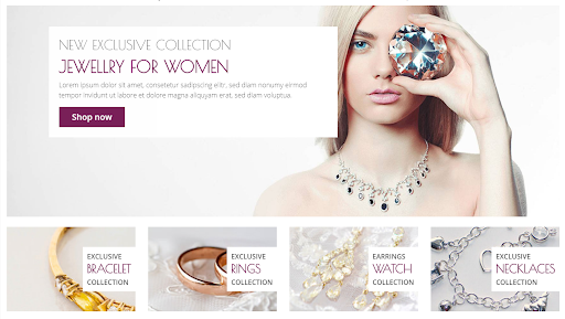
Lightspeed eCom theme store theme Dixi has a header with space for a big eyecatching image.
If your store focuses on selling just a few unique products, look for themes that feature minimalistic styles that can highlight your products while not looking cluttered.
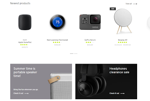
You get a quick overview of products without extra clutter from the Voila theme in the Lightspeed eCom theme store.
3. What is my budget?
While it’s a good idea to have an idea of your budget from the beginning, you probably shouldn’t start by browsing all the themes that fall under it. This is because you’ll have a hard time narrowing down which theme is right for you—affordability isn’t the only factor you need to keep in mind, after all.
Themes in the Lightspeed eCom theme store range from free to around $25.00 USD a month. While you may be tempted to go with a free theme—and indeed, a free theme may suit you at first—paid themes have more features. You’ll also have more selection if you’re willing to pay even a little for your website theme.
Support is important, too. While all the free themes in the Lightspeed eCom theme store come with customer support, free themes from other sources may not.
Setting up your theme
Ready to start picking your website theme? Great! Open up your eCommerce platform’s theme store and look for the demo or preview button on the themes that include your top features. Play with the sites and pretend you’re a customer. If a theme checks all your boxes but doesn’t offer a great user experience, move on—it’s best to get this right.
Once you’ve got your theme picked out, don’t skimp on your product photography. You’ve implemented the perfect theme for your customer, so seal the deal with images that they can’t look away from.
Choose colors that match your in-store aesthetic and that have a lot of contrast. You can use that contrast to direct your customers’ eyes wherever you want them to go. Your choice of font should reflect your brand as well—an electronics store may opt to go for a modern sans serif font, for example.
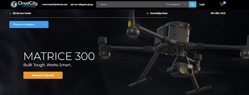
Lightspeed customer Cloud City Drones uses a modern sans serif font to complement their brand.
And don’t forget—we’re always here to help our customers. If you’re interested in how Lightspeed eCom could make going omnichannel to future-proof your business, you can reach out to an expert today.
News you care about. Tips you can use.
Everything your business needs to grow, delivered straight to your inbox.


