We all know that first impressions matter. When it comes to retail, they might mean the difference between a new customer and a lost sale. Your store needs to be consistently on its A-game, delivering the best visual representation of your products at all times. For a retailer, this means having a visual merchandising strategy.
Visual merchandising encompasses everything from storefront displays and product displays to in-store signage. Providing a visually pleasing experience is the first step in establishing a connection with shoppers coming to your physical store. By learning and leveraging design techniques, you can easily transform your store into an aesthetic experience your customers will love.
In this blog, we’ll cover:
- What is visual merchandising?
- What is the purpose of visual merchandising?
- What are the 5 key elements of visual merchandising?
- Visual merchandising tips and techniques
- What is a visual merchandiser and should you hire one?
Let’s get to work!
Turn window shoppers into customers
From merchandising to the how sales associates approach customers, the image your store projects is more important than ever. Download our free guide to learn how to attract more customers and turn them into lifelong customers.
What is visual merchandising?
Visual merchandising is a widely-adopted practice in the retail industry where merchandisers develop floor plans and three-dimensional product displays to organize and showcase products and maximize in-store sales. Typically, merchandisers will group related products together and use signage to communicate their features and benefits.
In larger companies, merchandisers work hand-in-hand with the retail marketing teams to build product displays that fit with the brand’s image and guidelines. Independent retailers, on the other hand, have more control over what the displays look like and more room for creativity.
What is the purpose of visual merchandising?
The purpose of visual merchandising is to attract and engage customers and motivate them to make a purchase. Additionally, visual merchandisers help organize a store’s products so that it’s easier for customers to find exactly what they’re looking for.
What are the 5 key elements of visual merchandising?
Various components come into play when crafting visual merchandising displays, but the elements below are arguably the most important ones.
Focal point
The focal point is the part of the display that you want people to focus on. Typically placed at eye-level, your focal point could be an item (or a group of products) you want shoppers to notice.
Let’s say you’re an apparel store manager who wants to showcase your new arrivals. One thing you could do is create an outfit featuring those fresh items, and place them on a mannequin at the center of your window display.
Space
The amount of space between products can convey volumes. In retail, customers often equate space with luxury, which is why it’s common for high-end brands to put a lot of space between merchandise when displaying them in-store. Meanwhile, discount retailers have a tendency to fill up their shelves with more products, leaving less space between items.
Keep this concept in mind when crafting your displays. If you’re trying to position an item as one-of-a-kind or exclusive, then it makes sense to put more space around it.
On the other hand, if you’re hosting a large sale and want to communicate that shoppers can get more bang their buck, then having additional products on display may make sense.
That being said, having more items doesn’t mean you should create a cluttered environment. Displays—regardless of how much merchandise they have—must be kept neat and organized at all times.
Colors
Different colors can evoke various emotions and behaviors in consumers. Red, for example, conveys energy and urgency which is why it’s often used in “SALE” signs. Meanwhile, the color blue can convey trust and responsibility which is why it’s popular in the realm of financial services. Black, on the other hand, can represent luxury, so it’s commonly seen in high-end boutiques.
Needless to say, colors matter a great deal in visual merchandising, so choose your palette wisely.
Colors invoke emotions, memories, and even specific reactions. Understanding color psychology can help retailers emphasize products, provoke emotions, and set the mood in their store. For instance, red can invoke urgency, perfect for clearance sales, while blue emanates trust and dependability.
Lighting
When used properly, lighting can help draw customers’ attention to specific parts of your store or display. If you want to highlight certain items more than others, then placing them under brighter lighting is a good idea.
In some cases, lighting can also influence people’s moods and behaviors. Brightly-lit displays can inspire energy and action, while displays that use subdued lighting can help people slow down or feel more relaxed.
Optimal lighting can drastically improve the in-store experience and drive sales. A well-lit product can grab attention, highlight its features, and even influence the mood of customers. Both the intensity and the color temperature of lighting matter; for example, warm lighting can create a cozy ambiance, whereas cool lighting can make a space feel more spacious and modern.
Positioning
Positioning is another key factor in merchandising. Consumers tend to browse shelves at the eye-level; they’ll also focus more on things right in front of them, versus looking at the sides or at the back of a display.
As such, it’s important to position and arrange your products accordingly. You can, for example, place your high-margin items front and center, while adding other items at the sides or behind your priority merchandise.
Visual merchandising tips and techniques
Studies show that an appealing display can increase sales by up to 540%. Moreover, 84% of consumers believe that a store’s aesthetics significantly influence their purchasing decisions. Harnessing these insights can tailor your visual strategies to drive conversions. You don’t need to spend a lot of money to create product displays that beautifully showcase your products and convert more people in research mode into paying customers. Just follow these 11 visual merchandising tips and techniques:
- Appeal to the five senses
- Use design theory to build your displays
- Be bold
- Play off your store’s theme
- Guide customers through your store
- Add interesting signage
- Group products that are commonly bought together
- Routinely refresh your product displays
- Boost sales with six budget design ideas
- Understand your target customer’s psychographics
- Get inspired
1. Appeal to the 5 senses
While it’s tempting to focus on your product display’s visual look, don’t neglect the other four senses.
The secret to a truly experiential retail store is to create a multisensory experience (also known as sensory branding). Here are a few ways you can create product displays that engage with each of the five senses:
Sound
The music you play in your retail store can have a big (but subtle) effect on how customers behave. Depending on your target customer, you can play mellow, soft music to encourage them to take their time and browse. When curating your store’s playlist, think of your target customer and what they listen to: you want the music to be appealing to them, first and foremost.
Touch
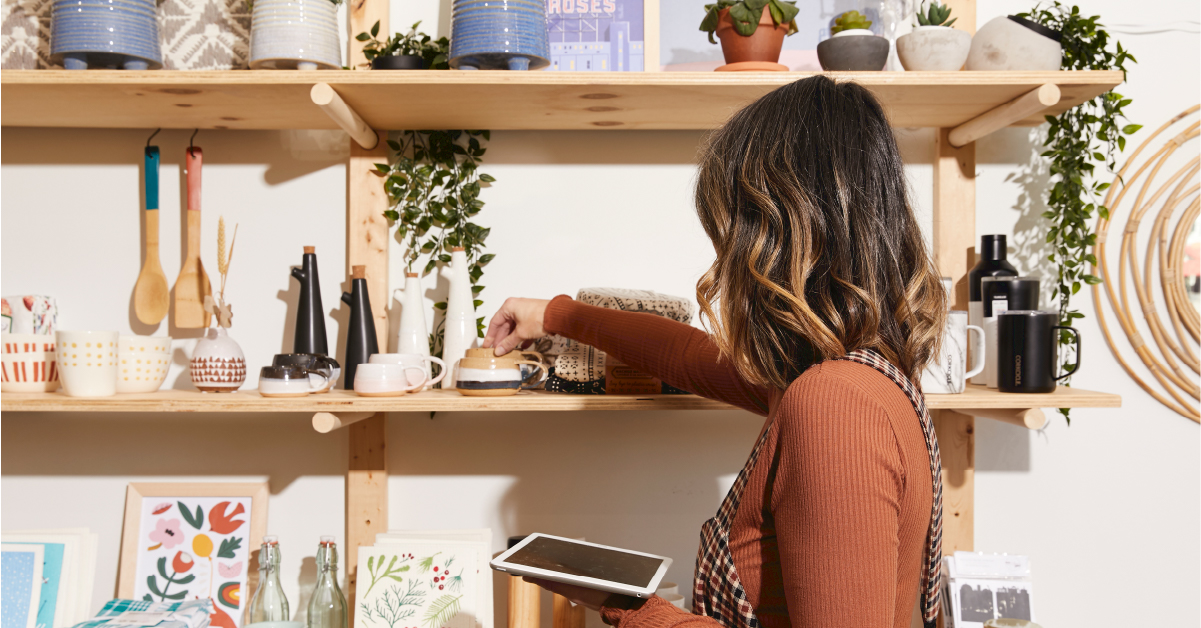
Remember to give your customers the ability to touch, feel and test out whatever you’re selling.
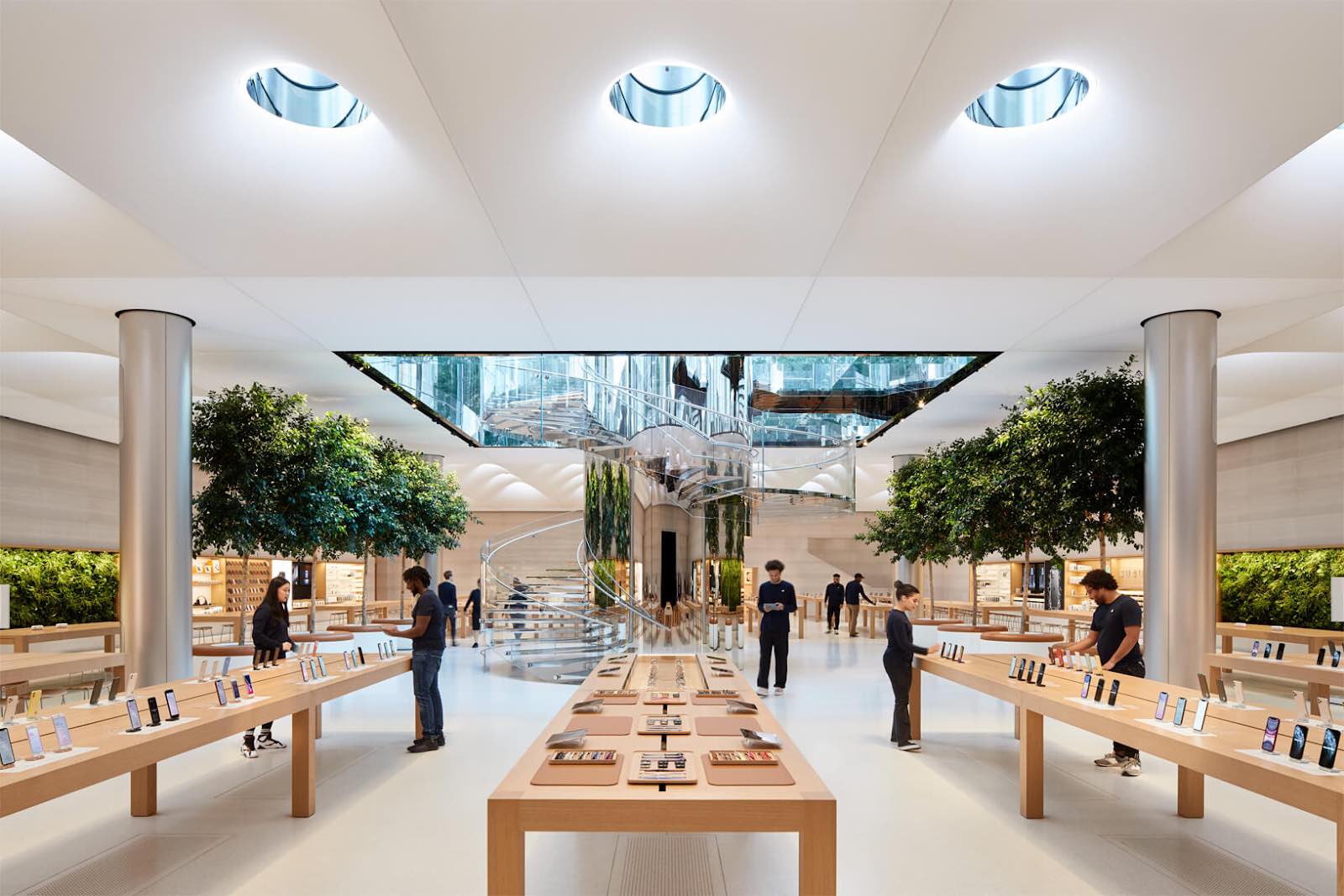
Perhaps the most widely-known example of a retailer that leverages touch is Apple. Each of their products are featured on an open display and ready to be used by customers. This helps customers foster a sense of ownership over the product they’re using and increases the probability that they’ll buy it.
Smell
Do you know about scent marketing? Global megabrands like Sony, Verizon and Samsung have used it to their advantage with great results.
Scents are quickly transmitted to the amygdala, the part of the brain that controls both emotions and memory. If someone smells something they like, it’s automatically registered as a positive memory that makes them feel good. Scent can be a deciding factor for attracting more long-term customers.
Taste
If your business sells consumables, giving customers the ability to sample products before they buy is similar to letting customers try on clothes. It’s a best practice.
In his book Influence: The Psychology of Persuasion, Robert B. Cialdini, Ph.D., showcases research that demonstrates the power of giving something away for free. Whether they realize it or not, those on the receiving end feel a need to reciprocate, usually by buying the product.
One retailer that does an excellent job at engaging customer taste buds is The Olive Oil Dispensary (TOOD) in Burlington.

Sight
From using colors for their psychological triggers to using lighting, balance, symmetry and contrast, merchandisers need to control where and what a customer looks at in-store.
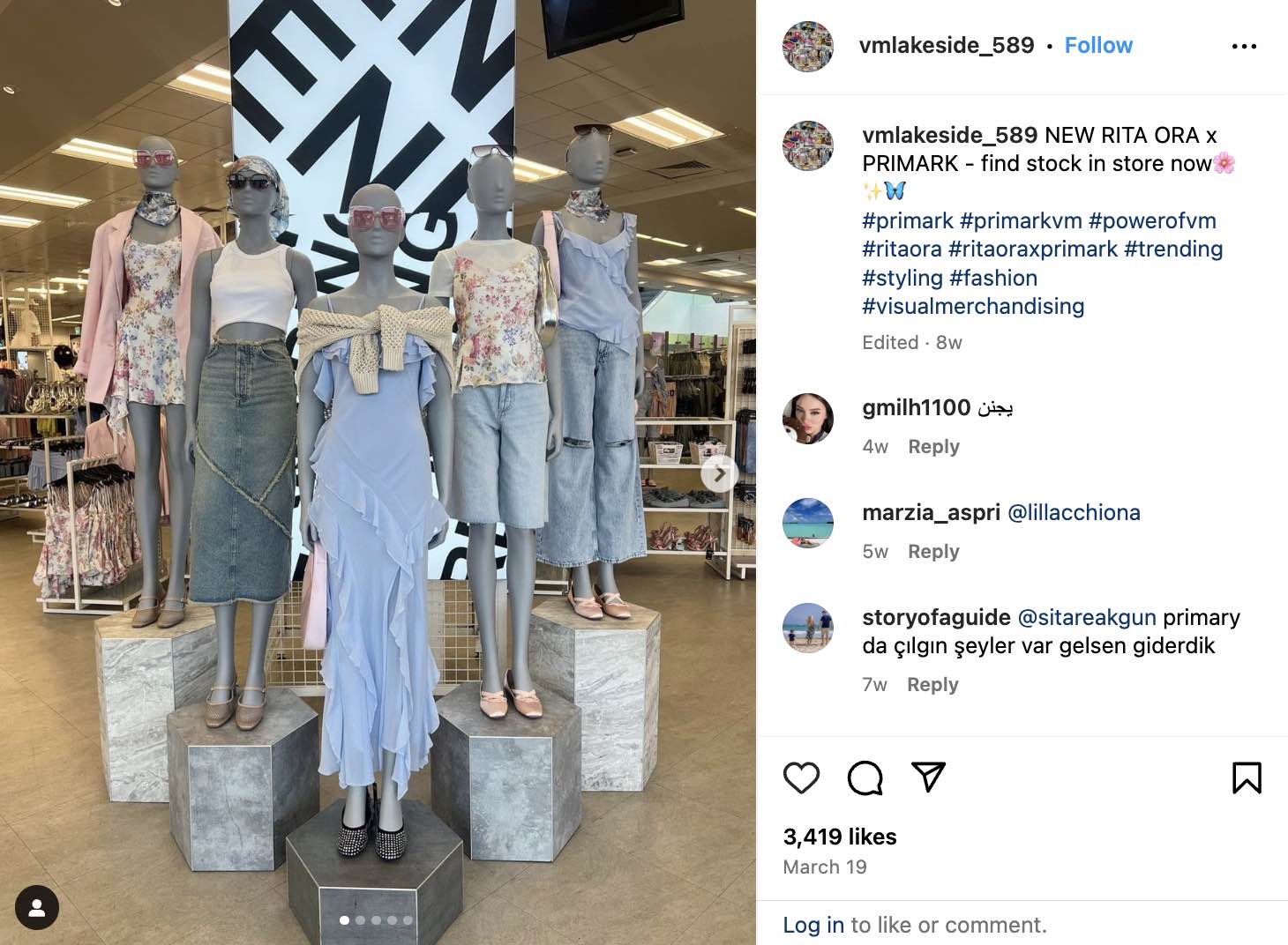
This spring-themed Primark display does a great job at combining various visual elements—i.e., color, shape, texture, height, etc—to create a cohesive display. The retailer uses different pedestals to vary the height of the mannequins, but it maintains balance by evenly spacing the mannequins and ensuring a consistent visual flow.
As for the colors, Primark incorporates a great combination of soft hues of blue, pink, and neutrals.
(Source)
2. Use design theory to build your displays
Your displays are a critical part of your overall design and can easily make or break the flow of your store. Understanding some key design theory will help you build displays that are eye-catching and go with your in-store design.
In general, less is more. When you’re living in a sales per square foot kind of world, this might sound counterintuitive. After all, your retail sales per square footage affect your store’s revenue. But the reality is that if your store design is messy or crowded, you’re going to drive customers away.
When building your displays, keep these four design theories in mind:
Balance
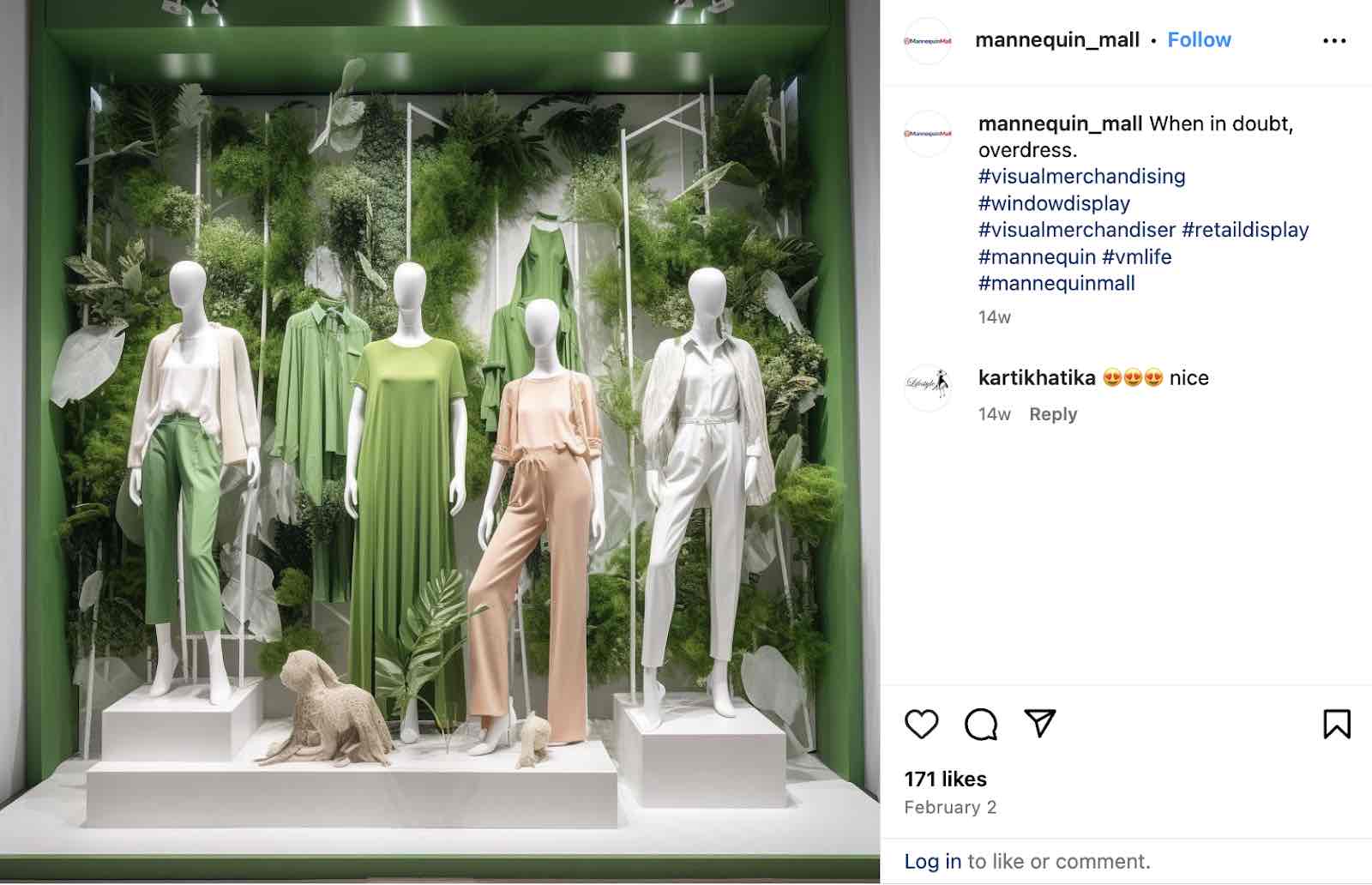
Achieving balance within your in-store displays is key in guiding your customers around your store and providing a cohesive experience. Balance in your store can be either symmetrical or asymmetrical.
Symmetrical balance uses design elements that have the same weight, while asymmetrical uses items of different weights. While symmetrical displays can add consistency and order to your store, sometimes using asymmetrical designs can help add a more interesting touch to your display, adding more of a focal point to certain elements in your design.
(Source)
Contrast
Providing contrast will help you bring emphasis to items or displays within your store. Ultimately you don’t want your customers to get lost in a sea of products. Having a focal point within your displays will help guide your customers’ eyes to certain products or sections.
Choosing certain color schemes can help provide contrast to your displays. Using black and white, monochromatic colors or other contrasting colors can also add a pop to your displays.
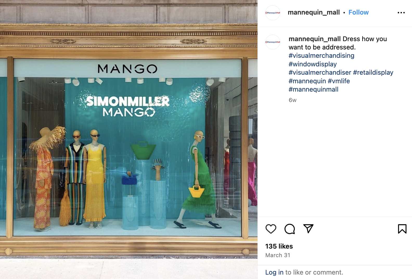
Check out this display from Mango, which uses contrasting colors of green, blue, yellow and orange to create visual interest and draw attention to key items.
(Source)
White space
Not every corner or space in your store needs to be filled with displays or products. White space, or negative space, is an important component of your store design.
White space can ultimately help highlight certain displays or products, adding a focal point within your display and reducing clutter. When used correctly, white space gives your product’s room to breathe.
Apply this design principle to your store’s window displays, at your point of sale and throughout your retail location.
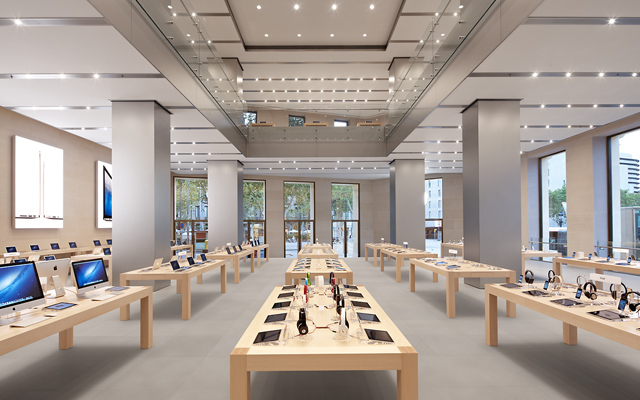
Retail giants like Apple have mastered the art of creating in-store experiences, so much so that their stores are instantly recognizable around the world.
Apple is also well known for their use of white space. Their minimalist and modern in-store displays are beautifully simple, with the purpose of keeping the products on the center stage, allowing customers to use and feel them as they go along without creating clutter.
Unity
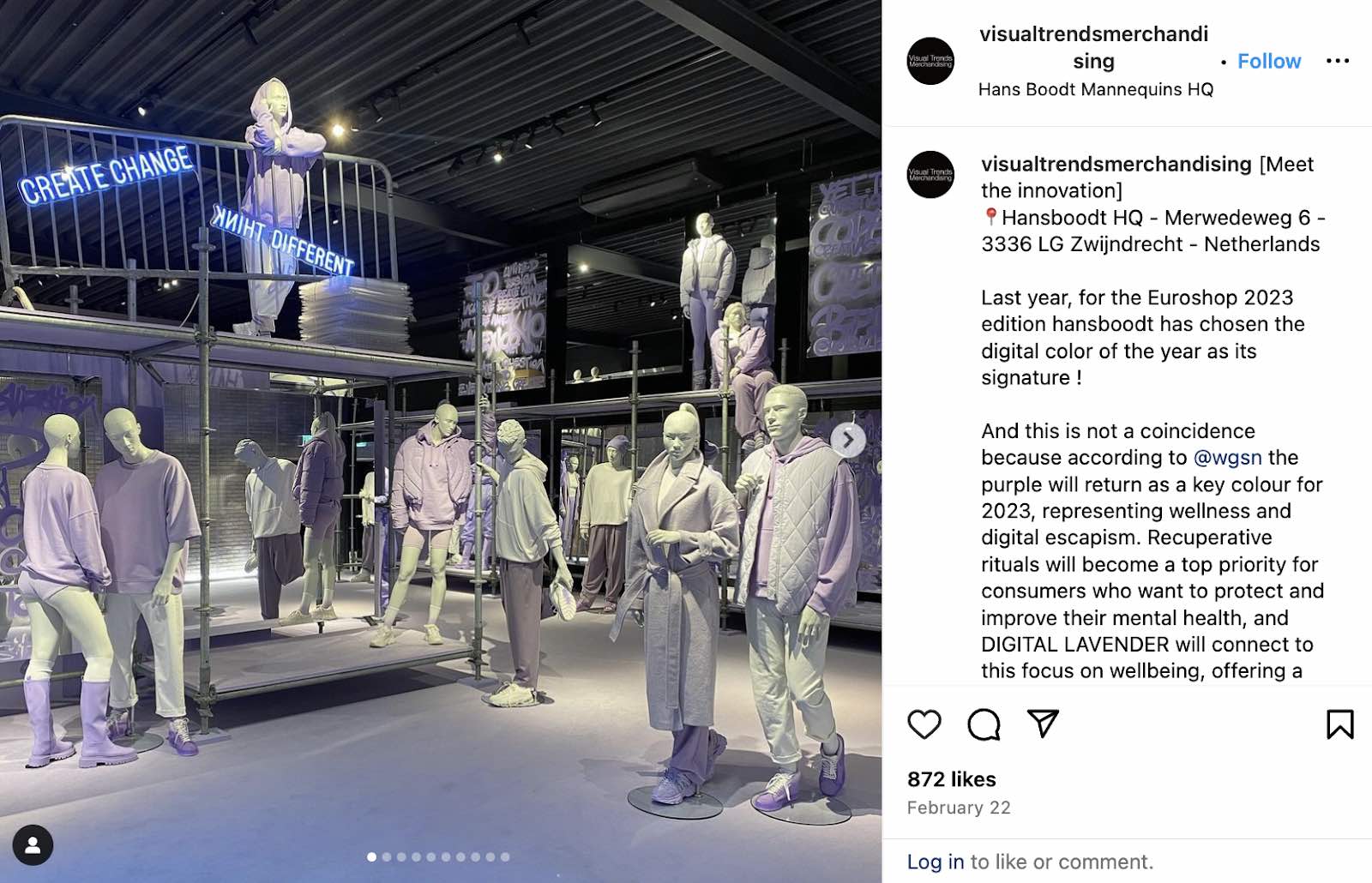
Ultimately, the overarching element you need in any store is cohesion. Creating unity amongst all your in-store displays, decoration and design will make your store come together visually for your clients, and help you stay on brand.
Make sure all the design elements you are using when putting together your store make sense with your overall brand. You might find great props or accessories, but the most important thing to keep in mind is whether or not they fit with the story you want to tell.
(Source)
3. Be bold
The goal is to create product displays that get customers to react: by snapping a photo and sharing it on Instagram, interacting with the products and eventually buying them. To do that, consider being bold with your visual merchandising.
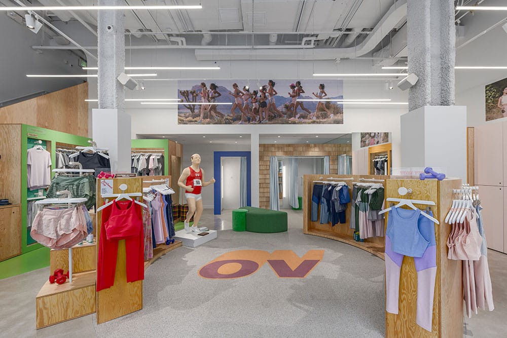
Just look at how athleisure apparel brand Outdoor Voices went bold with their New England store. Bold, contrasting colors and even a marathon running mannequin.
4. Play off your store’s theme
When it comes to designing your window display, it’s important to remember that your window is only one part of your overall store design; make sure it matches your store’s overall decor, style and branding.
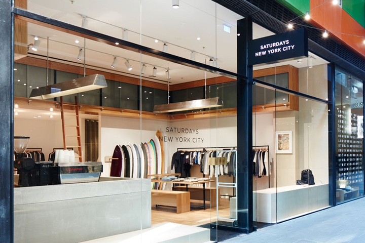
Take this visual merchandising example from New York-based retailer and cafe Saturdays NYC. Their name says it all: they sell apparel that’s inspired by surf culture (and surfboards). Their store in Melbourne, Australia puts what makes them unique on full display.
5. Guide customers through your store
IKEA has become a worldwide example of using visual merchandising to guide customers through their stores. Their maze-like concept groups products by living space and takes buyers through a home shopping journey.
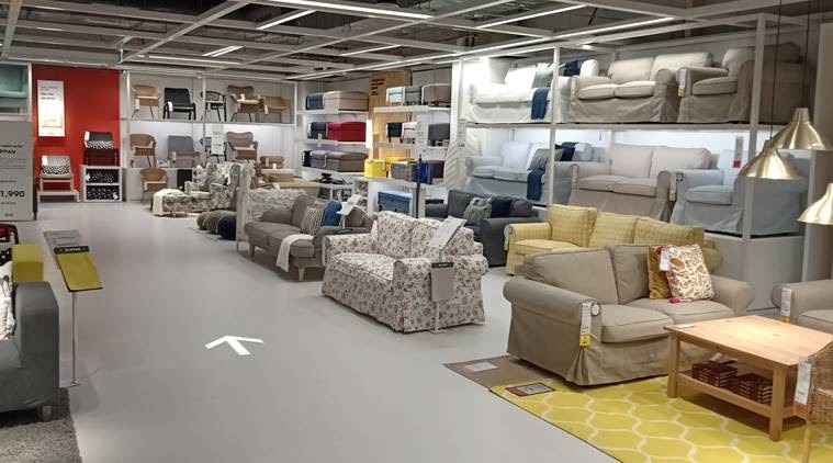
Have you ever gone to IKEA and left the store with more products than planned? Their path-like concept means you can’t really see what’s coming next, instilling a need to stay on course, picking up more items along the way. This ultimately generates a sense of ownership over the products, decreasing the chances that you’ll put them down before you get to the cash.
While you might not have the same space or concept as IKEA, the same rules apply. Grouping products that share a similar theme makes your store easier to navigate and allows customers to browse by category and find additional add-on purchases along the way.
6. Add interesting signage
Creative signage can help you clearly group and departmentalize your products, tell customers how they’re made, display promotions and more.
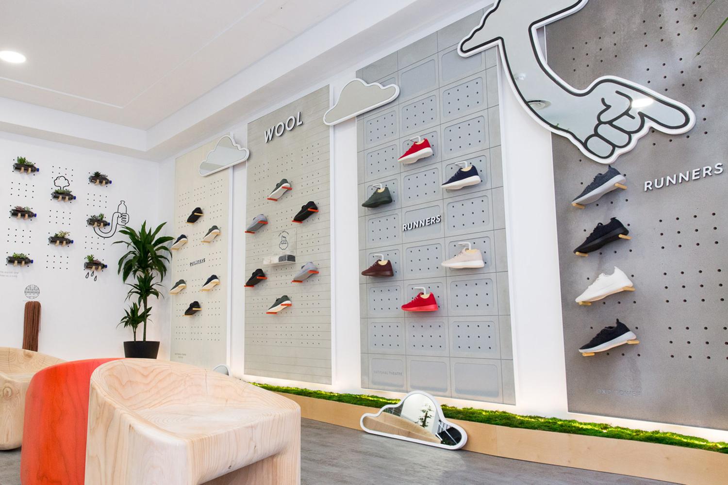
Just look at how Allbirds uses in-store signage to clearly show customers which category their shoes belong to. This helps customers find what they’re looking for quickly and compare products (plus, they look really cool.)
7. Group products that are commonly bought together
One way to improve your in-store experience is to use your displays to cross-sell certain products. By using a point of sale with reporting capabilities, you can easily find data about what products to cross-sell and how to arrange your displays.
Cross-merchandising is a great way to increase your customers’ average basket size. By conveniently placing products that go well together, you make their shopping journey much easier, and also give them ideas they might not have thought of before.
If you own an apparel shop, make sure you keep outfit elements that are displayed on mannequins within close range to make the shopping journey as easy as possible for the customer. You can also use signage to give customer’s ideas of what to buy, or what accessories might go well with the product they are looking at.
Cross-merchandising involves displaying complementary products from different categories together. By placing items that are often used together in proximity, you can encourage customers to purchase more.
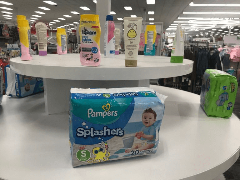
Check out this merchandising strategy from Target, which showcases baby sunblock alongside swim diapers. Target understands that customers buying swim diapers are likely also searching for sunblock, so the team strategically placed these products together.
8. Routinely refresh your product displays
Your store’s design isn’t meant to stay the same. Every time you have new, noteworthy inventory or transition from one season to another, you should consider refreshing your store’s merchandising, displays, layout and signage.
Bob Phibbs, one of the world’s leading experts in brick-and-mortar retail, suggests that merchants update their product displays on a monthly basis.
Times change and so do your customers. Keeping your store relevant goes hand-in-hand with your design and how and when you update it. When creating your store design, make sure you opt for something you can adapt with time.
Seasonal window displays align your brand with ongoing cultural and seasonal moments, drawing customers into your store. Whether it’s a winter wonderland during the holidays or a beach vibe during summer, ensure your window display resonates with the current season and festivities.
9. Budget design ideas
There are, of course, a million ways to improve your store design, but we don’t all have the funds required for an expensive overhaul. Here are six strategic ideas to help you spruce up your retail space without blowing your budget.
Do a deep clean
Half of shoppers have avoided a business because it looked dirty from the outside. This doesn’t just mean you need to get your front windows washed, although that should be at least a biweekly habit. It means digging deep and cleaning less visible areas like the restrooms and under equipment.
Adjust your lighting
We mentioned lighting earlier in this article, but it also deserves a mention here because it’s such a quick and easy way to make your merchandise stand out.
As bulbs age, they can give off a brownish light rather than a crisp white-yellow light. Consumers respond well to bright light because they can assess the quality and color of your wares more easily. This is why strip malls are always brightly lit.
In general, lighting is overlooked by many store owners. Edison lights, uplighting, spotlighting and track lighting can all be used to highlight certain elements and draw attention to promotions. It can also serve as an important way of setting the scene in your store.
Explore nontraditional merchandise displays
Shake up the way you showcase your wares by using nontraditional shelving options. Think oak rum barrels, clothes displayed around an old bicycle or second-hand shelves.
Remember that 25% of all small businesses fail within their first year. The upside to this is that there are plenty of retail fixtures and paraphernalia circulating at any time. Think creatively about how you can use those materials to suit your merchandising needs. Even if they don’t seem like a perfect fit at first, it’s amazing what a bit of ingenuity can do.
Create simple speed bumps
In retail, speed bumps are designed to do exactly what they do on the road: slow you down. Small tables and sales racks make great speed bumps throughout your store. Create a theme with each rack and rotate the product on your speed bumps regularly to keep regulars engaged.
Design a power wall
A power wall is a display organized to showcase popular products that you want customers to associate with your brand. Think Old Navy’s jeans display, or a tea store’s wall of loose leaf tea tins.
An effective power wall, traditionally placed to a customer’s immediate right, commands attention. Display your featured inventory here, like your most popular items or latest styles.
Opt for displaying eco-friendly materials and promote sustainable products in your displays. With sustainability becoming a growing concern among consumers, highlighting green practices will resonate with environmentally-conscious consumers while also reducing your carbon footprint.
10. Understand your target customer’s psychographics
Understanding your target customer is the first step to creating effective visual merchandising and product displays.
We don’t just mean understanding demographic data like their age, income and education. Dig deeper into their psychographic information and get to know what drives their decisions and what type of lifestyle they live.
A good way to start is by combing through the customer data on your point of sale system (especially a customer’s order history).
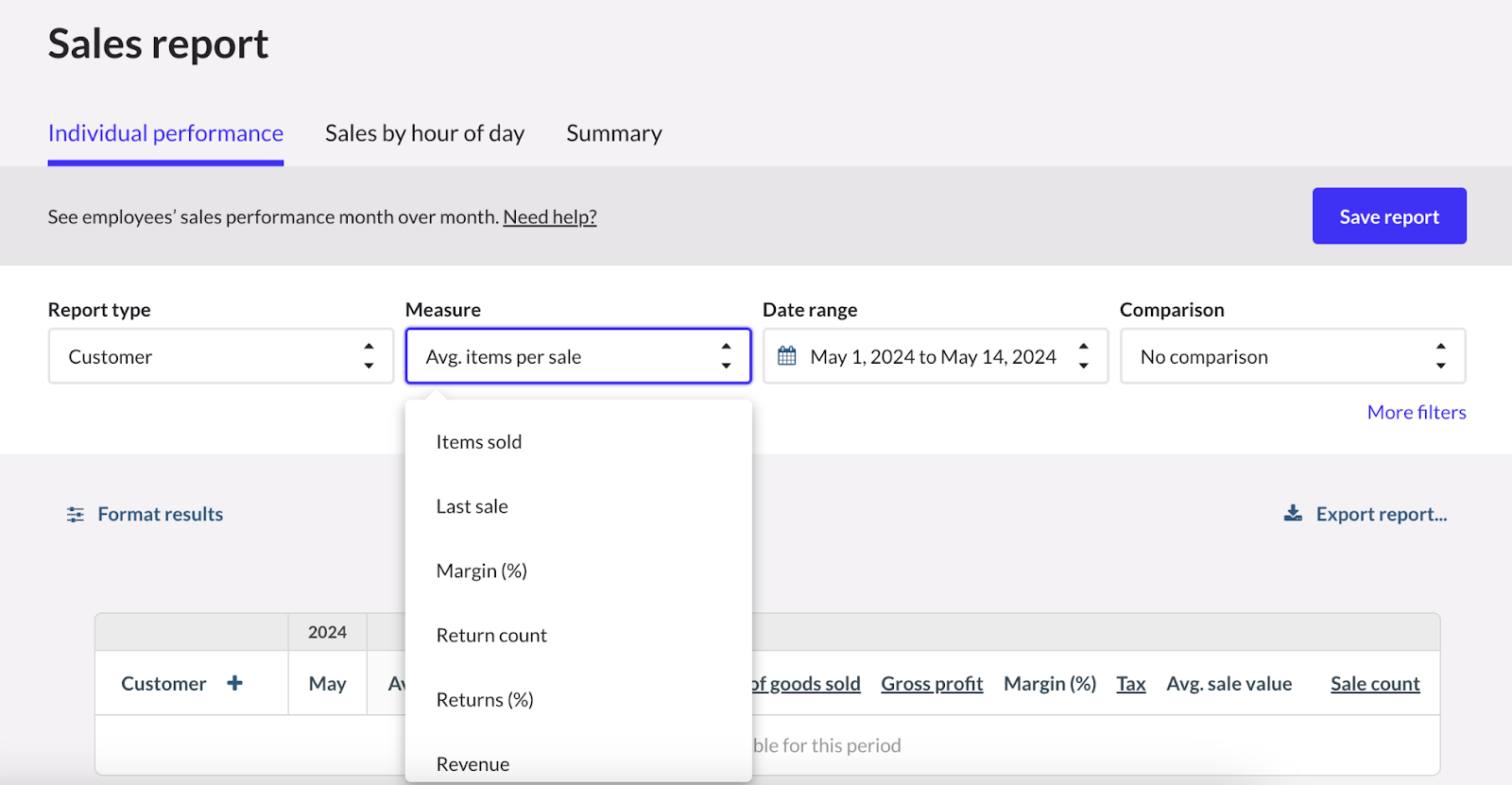
Pro tip: you can easily do this with Lightspeed Retail’s Sales reports which enable you to filter the data by customer. Drill down on the items you sold, product returns, revenue and more.
11. Get inspired
With the internet, sources of merchandising inspiration are nearly endless. Before you start building your displays, try skimming these resources for storefronts that have created eye-catching product displays of their own:
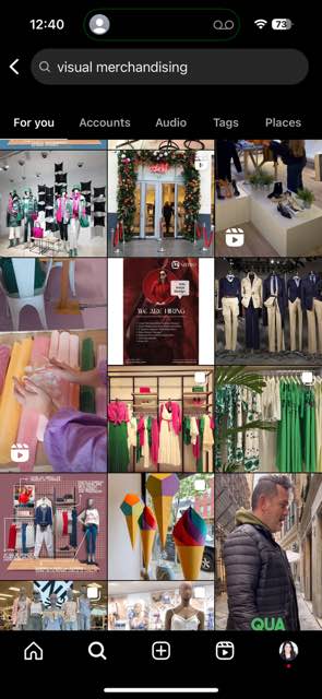
For example, searching “visual merchandising” on Instagram will show you accounts and posts dedicated to retail visual merchandising displays. You’re bound to get ideas as you scroll through the content!
What is a visual merchandiser?
Many small business operators and managers are happy to wear the visual merchandiser’s hat. It’s not uncommon for local retail store owners to create their own display windows and store layouts.
However, there is also a case for hiring a team member who is solely focused on visual merchandising. This is particularly true if you don’t have the necessary knowledge or if you’re running multiple locations and need a cohesive strategy.
This is where a visual merchandiser comes in. This individual can be a full-time employee or a contract worker who’s responsible for:
- Defining the visual merchandising strategy of the retail business
- Ensuring the store’s strategy is brought to life through compelling store layouts, window displays, interior design, etc.
- Monitor visual merchandising costs and ensure that campaigns and initiatives are carried out within the allocated budget
- Measure the results of all visual merchandising efforts and gather data for continuous improvement
Should you hire a visual merchandiser or go the DIY route?
Bringing a visual merchandiser on board is a big decision, and the right answer depends on a number of factors, including your team’s capabilities, the size of your business and your budget.
Generally speaking it may be a good idea to hire a visual merchandiser if:
- You and your team have limited expertise. Your visual merchandising initiatives will be more successful if they’re carried out by someone who has the necessary knowledge and experience. If you’re new to visual merchandising or don’t have a knack for it, you may be better off hiring or outsourcing the job to someone with a deeper understanding of the field.
- You need to free up time and bandwidth to focus on other areas of the business. Visual merchandising can be time-consuming. If you and your team are struggling to manage the many moving parts of the business, then consider bringing in someone who can focus on your merchandising efforts.
- You have the budget to hire a visual merchandiser. Run the numbers to determine whether or not it makes financial sense to hire a visual merchandiser (whether on a full-time, part-time, or contract basis). The exact figures around compensation will depend on where you’re located, though according to the career website Glassdoor.com, the average pay for visual merchandisers in the United States is $40,605 per year.
Investing in training empowers staff to understand and implement visual merchandising strategies effectively. Regular workshops can provide them with the tools and insights they need to continually improve in-store displays.
The best visual merchandising is unique to your brand
At the end of the day, your store’s look will depend entirely on your products and your brand and how you want to connect with customers. Take the time to understand your brand and translate that into your in-store design. Ultimately, you need to create the design that’s right for you.
While brick & mortar stores focus on tactile experiences, online visual merchandising emphasizes high-quality imagery, interactive 3D models, and virtual try-ons. Simplify the browsing experience, utilize detailed product shots, and ensure a seamless mobile experience for online shoppers.
Want to learn more about how your point of sale can impact your store’s design? Let’s chat.
Visual merchandising FAQs
What is visual merchandising?
Visual merchandising is the practice of designing and displaying retail products in a way that maximizes sales and enhances the customer experience. It involves using color, lighting, space, and arrangement to create appealing and effective displays.
What does a visual merchandiser do?
A visual merchandiser designs and implements in-store displays and layouts to attract customers and encourage purchases. Their responsibilities include creating eye-catching window displays, arranging products strategically, and ensuring the store’s visual standards are maintained.
What is an example of a visual merchandising?
An example of visual merchandising is a clothing store’s window display featuring mannequins dressed in the latest fashion trends, complemented by themed props and coordinated lighting to draw attention and entice customers into the store.
PS: Check out the images and tips above for real life examples of visual merchandising in retail!
What skills does a visual merchandiser need?
A visual merchandiser needs a keen eye for design, creativity, and an understanding of color theory and spatial arrangements. They should also possess strong attention to detail, good communication skills, and the ability to analyze sales data to inform display strategies.
Does visual merchandising fall under marketing?
Yes, visual merchandising falls under marketing. It is a key aspect of retail marketing that focuses on the visual presentation of products to enhance the shopping experience and drive sales.
Is visual merchandising difficult?
Visual merchandising can be challenging as it requires a blend of creativity and strategic thinking. It involves understanding consumer behavior, staying current with design trends, and continually adapting displays to optimize sales and align with marketing goals.

News you care about. Tips you can use.
Everything your business needs to grow, delivered straight to your inbox.
