Type above and press Enter to search. Press Esc to cancel.

Retail

The Beginner’s Guide To Designing A Lucrative Retail Shop Floor Plan

The Beginner’s Guide To Designing A Lucrative Retail Shop Floor Plan

Imagine you’re the customer for a moment. When you walk into the store, what makes you first notice products?

What makes you like browsing through the products when you pass a display, aisle or shelf rack? And what makes you only linger in the entrance for a few seconds before walking away?

However you answered these questions, they all point to the importance of a key step when opening your retail store: designing your shop floor plan.

No matter how great your location is, you have to dress it up to create a warm, inviting environment that customers feel happy shopping in.  

In this article, we” cover:

  1. What are shop floor plans and why are they important?
  2. Four common shop floor plan layouts
  3. Plan your layout
  4. Positioning your POS
  5. Getting your shop floor plan right

Inventory management, simplified

Use our straight-forward inventory management template to streamline your processes, saving you time and money.

What are shop floor plans and why are they important?

This is where shop floor plans can help. They’re layouts that guide your customers on a route through your retail space. A good plan will consider your typical footfall, product placement, and ‘traffic’ flow.  

We hinted at the importance of floor plans to successful retail businesses earlier. 

But it’s actually hard to overstate how useful they can be for driving foot traffic, browsing, and in-store purchases.

“A shop floor plan takes an architectural floor plan and layers on plans for traffic flow, zones category adjacencies, and a fixture layout,” explains Ani Nersessian, a visual merchandising specialist at pop-up go, which helps retailers secure, design, execute, and promote pop-up spaces. “This helps to make the customer navigation experience as inviting, enticing, and organized as possible and is a required first step prior to determining the rest of the visual merchandising strategy.”

Different layouts can affect customer revenues in different ways. They can get your customers browsing around items in your store. A good layout will help keep customers longer in the store so that they’re more likely to buy something before they go. 

Think about your own experiences shopping. Take a store like Costco or IKEA. They carefully plan their walkways and they look at how customers navigate their stores so they’re shown as much merchandise as possible during their wander through the store. 

Four common shop floor plan layouts [plus their pros and cons]

Ideally, you’ll need to decide what kind of space you need before drawing up your shop floor plan.

“This will help you adjust the floor design according to the size and demands of specific products,” said Robert Johnson, the founder of Sawinery, a provider of woodwork services. “Keep in mind that creative cross-merchandising or placing products that go well with each other in a single display—even if they don’t belong in the same section or department—is a good strategy to boost sales.”

Let’s take a look at some of the common ways to lay out your retail store. 

1. Grid layouts for retail stores

You may have seen grids before in grocery stores or gas stations. They’re pretty good for categorizing different products. Grid layouts are popular for different retailers because they’re easy to set up and organize.

With a grid layout, you’d organise your shopfloor by placing your racks and shelves in evenly spaced ‘blocks’ through which your customers can browse with ease.


Customers have experience going into grids and they have experience going to grocery stores, so familiarity can be an asset. So it’s familiar, very easy to organize and it’s easy to set up for employees.

  • Pro: It’s easy to set up and it’s familiar to customers.
  • Con: It may be difficult to get your customers to look at all of your inventory with a grid, since there’s no guarantee that they’ll pass everything while browsing. 

2. Herringbone floor plans for retail stores

This one works well when space is at a premium, especially in long and narrow premises. A herringbone layout is when shelves and racks are laid out at a different angles. As a shopper, you might have seen spaces like this on busy mall floors or along streets where there is fierce competition for retail property.


As a retailer, you can make the most of the limited space by adding a focal point at the store’s back wall.

  • Pro:  Useful for retailers who don’t have much space to work with.
  • Con: It might be difficult for customers to see your products in the aisles.

3. Track layouts for retail shop floors

This is the IKEA layout we touched on earlier. Its a pathway that allows people to see multiple products. This kind of layout encourages customer browsing. And it’s great for giving exposure to as many of your products as possible.


This layout probably won’t work in a small space. And if you want your customers to be able to quickly grab their goods and go, it’s not that great either. Some customers may get annoyed, especially if they came for just one thing but have to traverse the entire ‘track’ to find it.

Pro: Great for encouraging browsing and product exposure.

Con: Some customers may find this layout frustrating.

4. Freeform layouts for retail stores

You could call this the ‘no layout’ layout. You’ll likely have your different displays, tables and racks that allow customers to browse. Unlike the track or grid layout, you’re not guiding your customers along a set store path. Often, there’s more space, customers feel less ‘managed’ and they can wander around and look at different displays freely.


Retailers need to make their products accessible to everyone. That means making sure customers with different mobility levels can reach all items. Set a maximum height for products to be displayed. Train staff to be mobility aware. And consider supplying motorized shopping carts, where possible.

Pro: This layout may be a good fit for creative fashion businesses and independent boutiques. 

Con: Customers may find it confusing to find products in big stores without proper signage.

Plan your layout

We said it earlier, but it’s worth repeating it: your floor shop plan heavily affects your customers’ shopping experience.

A data-driven, fact-based design guides shoppers through your store, while a poorly designed store annoys customers with carelessly placed items. Here’s how you can create a lucrative yet convenient layout, according to Nick Drewe, CEO of Wethrift, an ecommerce sales and coupon platform.

Consumer goods

“If you sell flowers, fruits, or vegetables, place them neatly in a basket near the entrance. Arrange your produce carefully to create a fresh, fragrant setting. Next, display expensive, slow-moving consumer goods like appliances, imported snacks, and small gadgets after the fresh produce,” suggests Drewe. 

Pricing

He suggests you also show off the pricey items first to make other products cheaper in comparison. Afterward, line the left and right outer shelves with less expensive, slow-moving consumer goods from well-known brands. Think of small, handy items that shoppers can easily pick up.

Impulse purchases

“Next, position the essentials in the middle and back portions of your store,” said Drewe. “Make sure that shoppers will only reach the fast-moving consumer goods like drinks, bath products, and raw meat after passing through non-essential items. By this point, most shoppers would have already grabbed at least one or two things they didn’t intend to buy. Finally, line the checkout counters with last-minute purchases like mint, chocolate bars, and cigarettes.” 


Positioning your POS

As Drewe’s comments suggest, your POS is your final chance to make an additional sale with your customer. So it’s important to get your cash register placement right. You want your cash register to be in a clear, prime position. And you need it to be easily reached from as many points in your store as possible. 
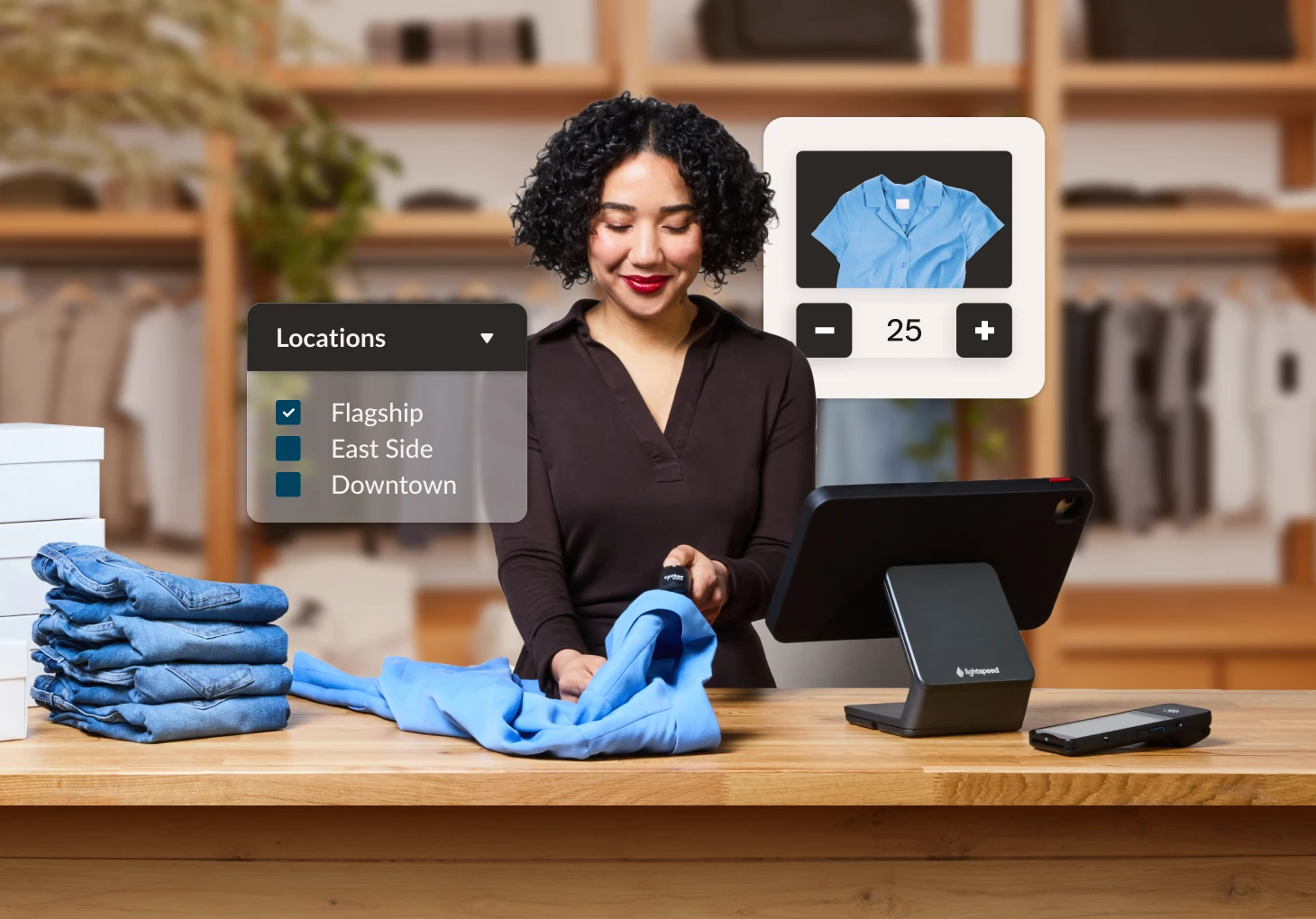
Allow for smooth movement of customers and staff around the POS. And ensure there is enough space for queues to form and flow. Think about how many terminals you’ll need and how you can ‘dress’ the POS area so it’s visually enticing and inviting.  
10 Tips for Designing a Lucrative Shop Floor Plan

1. Be aware of where you “lead” shoppers

There’s quite a bit of debate about whether or not retailers should lead customers in a clockwise or counter-clockwise fashion inside their stores.

On one hand, some claim that since most people are right-handed, they instinctively turn to the right and explore the store in a counter-clockwise direction.

However, other studies indicate that shopper direction has more to do with their vehicle traffic patterns. Consumers in the UK and Australia, for instance, drive on the left side of the road and so they have a tendency to explore stores in a clockwise manner, while consumers from right-hand driving countries like the US usually turn right when they enter a shop.

So which shopping direction theory should you believe? It looks like there is stronger evidence supporting the theory about driving behavior. As Herb Sorensen, author of Inside the Mind of the Shopper noted:

Tip: The pattern of movement in the supermarket is counterclockwise in the United States, but PathTracker studies in the UK, Australia and Japan show a much greater tendency for shoppers to move in a clockwise pattern there… traffic patterns in the store may also be affected by vehicle traffic patterns outside. In these small studies, we noted that in countries with right-hand driving, where traffic circles move in a clockwise pattern, shoppers in stores may be more comfortable moving in the same direction.

2. Ensure that your product quantities are appropriate

The question of how much merchandise to have on display is an important one—and the answer is not clear-cut.

On the one hand, having more products on the sales floor has proven to increase sales. When Dollar General increased their shelf heights to 78 inches, sales per square foot increased from $165 to $201.

Having too much product on the sales can lead to a decline in brand perception, especially if you’re trying to position yourself as a boutique or high-end retailer.

As Paco Underhill, author of Why We Buy told the New York Times, “the more a store is packed, the more people think of it as value—just as when you walk into a store and there are fewer things on the floor, you tend to think they’re expensive.”

The bottom line? The amount of stock to display in your store will depend on the size of your shop, the image you want to project and the type of experience you want to create.

If you’re a discount retailer who wants to make the most out of your store space, then packing your shop with merchandise could be a good strategy for you. But if you’re a high-end boutique, then it’s best to keep your selection curated and just put a few select items up for display.

3. Have enough space between products and fixtures

It’s okay to have shelves that are packed with merchandise (if that’s what you’re going for) as long as you still give your customers their personal space.

You want to avoid the butt-brush effect, which according to Underhill, is a phenomenon where shoppers would abandon a display or product they were looking at when they were bumped once or twice from behind.

“While studying how shoppers negotiated the doorway during busy times, we began to notice something weird about the tie rack that was placed next to it,” says Underhill.

“Shoppers would approach it, stop and shop until they were bumped once or twice by people heading into or out of the store. After a few such jostles, most of the shoppers would move out of the way, abandoning their search for neckwear.

“We watched this over and over until it seemed clear that shoppers—women especially, though it was also true of men to a lesser extent—don’t like being brushed or touched from behind. They’ll even move away from merchandise they’re interested in to avoid it.”

4. Use your layout to drive impulse sales

Your store layout can be a powerful tool to increase sales. With the right merchandising, you could put key items in the radars of your customers and drive impulse purchases.

Supermarkets are really good at doing this. Most grocery stores utilize their checkout to showcase popular impulse-buy products, such as gift cards, candies and other items.


Another way to promote impulse purchases is to cross-merchandise your shelves with products that complement each other. Many apparel retailers implement this by displaying clothing items together with matching accessories.

5. Freshen up your displays regularly

The rules around how often to change up your displays will vary depending on who you’re talking to and the type of store you run.

That said, most experts recommend changing some part of your store around once a week. You could, for example, change the outfits of your mannequins or feature a different upsell every week. And for obvious reasons, you want to switch up your merchandising whenever new products come in.

Also take into account the amount (and nature) of traffic that you’re getting in your store or shopping center. Do you get a lot of the same shoppers walking by? Are you on a busy street corner that’s on the way to people’s work locations? If so, then you’ll need to change up your displays more frequently in order to grab people’s attention on a consistent basis.

The last thing you want is for customers to get too accustomed to your store that it doesn’t even register when they pass by.

6. Find ways to appeal to multiple senses

While the majority of a location’s design is made up of visual components, other factors—including scent, touch, sound, and taste—can also make an impact on a store’s look and feel. If you wish to create a truly immersive in-store experience, design your store to appeal to as many shopper senses as possible.

Here are a few ideas:

Sound

Pick your playlist wisely. Determine the atmosphere that you want to create and pick songs that enhance (and not overpower) the ambiance. Volume and beat can influence behavior, depending on who you’re selling to. For instance, while loud music may work well for retailers that target younger shoppers, the same thing can’t be said for merchants catering to adults.

Before playing music in your store, research the music copyright laws that pertain to your region. 

Scent

Bakeries and cafes may have a slight edge here, as they can use the smell of their products to draw customers in. But you can still cater to people’s sense of smell even if you aren’t in the food industry.

Many retailers craft scents made out of their best products. Brandi Halls, Lush’s director of brand communications for North America, told Racked that the strong scent in their stores is a mixture of their top products.
“When I walk in, I can definitely smell the Avobath bath bomb, the Karma soap and the Vanillary perfume. These are some of our cult products,” she added.

Touch

Having a “hands-on” vibe can enhance shopper experience. One way of doing this is to take out sample products from their boxes to encourage customers to test or play with them.

Apple pioneered this approach in the electronics retail space when they launched stores that had their products out in the open instead of being inside big brown boxes (which was the norm at the time).

Consumers loved it, and soon other retailers in the computer and electronics space followed suit.

Taste

If you sell food in your store, see if you can have taste testing stations. Again, this encourages a more hands-on shopping experience and makes it less intimidating for people.

Check out what Brandless did when in their LA pop-up store. To give people a taste of their coffee and tea, they set up a station where people can sample the products.

Even if you’re not selling edible products, you can still appeal to shoppers’ sense of taste by offering nibbles and drinks that they can enjoy while shopping.

Cosmetics store Birchbox, for example, occasionally serves champagne in-store. Here’s a shot from their SoHo location in January.

7. Don’t forget to cross-merchandise

Grouping your merchandise into neat categories or departments is a great strategy, but see if you can find room to cross-merchandise different items. Identify products in your store that would go well together and put them in a single display.

View your merchandise from a customer’s perspective. For example, if you were a shopper looking at a particular dress, is there anything in the store that would go well with it?

Have a look at this display from Gymboree, which cross-merchandises a range of shirts and sweaters with a matching purse.

Here’s another example from Target. The top shelf showcases different brands of sunblock for kids, while the shelf directly below it has swim diapers on display. Target knows that customers shopping for swim diapers will likely need sunblock (and vice versa) so they cleverly put the products together.

8. Make sure your employees are on point

Don’t forget that your staff also plays a role in your store’s design and layout. How they are positioned in your shop floor plan can make or break your store’s appeal. Having your employees move around on the sales floor instead of staying behind the counter is a good way to make the place more inviting.

As the Retail Doctor Bob Phibbs said on his blog, “Get your employees out from behind the counter and keep them active, especially if you have windows.”

Consumers looking into your shop will be more enticed to walk in if they see people moving about. That’s why Bob recommends that merchants instruct employees to “act as if they were customers” if a store is empty in order to make it more enticing.

9. Incorporate seasonal colors and trends

Your displays need to be relevant to your customers, and one of the best ways to create retail designs that resonate is to incorporate trendy and seasonal elements into your shop floor plan.

Change up your displays based on what’s happening throughout the year. If there’s a big holiday coming up, then weave in components relevant to your fixtures and displays to maximize their impact. Ditto for upcoming and current seasons.

Spring, for instance, is known for bright and blooming colors, while autumn is more about warmer tones. Whatever the case, you’ll need to adjust your layout and displays accordingly. 

Take a look at the visual merchandising example below, which effectively make use bright color combinations in line with spring time.

10. Track and measure your efforts

Last not but not least, always ask whether or not you’re making the right shop floor plan, design, or arrangement decisions. This is critical to making sure that you’re implementing the best strategies possible.

You and your staff should be very observant with how people behave in your store. Pay attention to where they go, where they linger, and what they do while they’re inside. Also ask questions on what they think of your shop and what you can do to improve.

Let’s say you’re implementing a major layout or merchandising change in your store. You want to benchmark metrics like sales, traffic, and dwell time before you make the updates, and then measure the results once the changes are implemented. (Pro tip: Use POS reporting software to track your performance. This will save time and make data-gathering so much easier.)

Also, consider making use of foot traffic analytics solutions such as people counters, beacons, heat sensors, and more. These tools can give you deeper analytics and insights on shopper habits and behavior, so you can make data-driven decisions.

Finally, you need to ensure that your layouts and displays are being executed correctly, so conduct store audits whenever you make changes to your store. Consider using a tool such as Compliantia to evaluate your stores.

Getting your shop floor plan right

Whichever floor plan you choose, don’t worry if it doesn’t work well on the first attempt. You can get creative with displays and visual merchandising to ensure you’re always testing and learning. In even the smallest of spaces. 

And if you do want some help figuring out how a point of sale fits into your floor planning, then feel welcome to have a chat with one of our experts

News you care about. Tips you can use.

Everything your business needs to grow, delivered straight to your inbox.

More of this topic: Management & Operations