
Aside from your eCommerce site’s overall design, professional-looking product photography will influence whether or not people decide to shop with you. Improving your eCom store’s usability can be as easy as having great product photography.
It’s important to remember that online shoppers don’t have the same sensory experience as those who shop in-store. They can’t touch, try or feel the products you sell. Great eCom product photography will not only show what the product looks like, it will show a product’s texture, fit and appearance from multiple angles and settings.
Even if you’re not a pro behind the camera, you can take great product shots that increase your online sales. That’s why we’ve listed ten tips for great DIY eCom product photography. Apply them during your next photoshoot to make your eCom site look more professional and generate more revenue.
Here are 10 surefire ways to improve your eCommerce product photography:
- Make your image sharp
- Photograph the entire product
- Adjust your photo exposure
- Keep your sizing consistent
- Place your products front and center
- Remove any background
- Add reflections
- Feature more than one image per product
- Watermark your images
- Showcase each product color
Learn how to bring your retail business online
Be ready for whatever life throws at you—from extended store closures to evolving customer expectations. Learn how to bring your products online and start selling fast with our free quickstart guide.
1. Make your image sharp
The single most important thing about any product photography on your eCom store is the sharpness of your images. Blurry, pixelated photos make it harder for shoppers to get a clear picture of your product and ultimately have a negative impact on user experience.
Poor image quality makes visitors perceive your website as less trustworthy, and they may take their money elsewhere. If you’re using a DSLR camera, make sure it has a wide aperture range. The lower the aperture, the easier it is to focus your camera’s lens on the product you’re trying to sell, which will help you take a sharper, clearer photo that does the product justice. Modern iPhones also mimic this effect with portrait mode.
2. Photograph the entire product
This tip may seem obvious, but make sure that the entire product is visible in its hero photo.
Your product should be straight, level, without wrinkles and have a decent amount of blank space around it. If not, shoppers are less likely to click buy. Clean product photography clearly communicates to potential customers that you’re a reputable business, not a hobbyist.
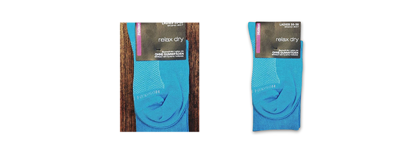
If you need to retouch your photos (i.e. remove wrinkles, dust or background clutter), try a user-friendly app like Retouch.
3. Adjust your photo exposure
Make sure that the product is properly exposed. This means that multiple light sources are sometimes needed to prevent shadows and dark areas on your product. If you don’t have access to a light box, consider shooting in natural light outside or combining the light from a window with an overhead light for proper coverage.

Pro tip: It’s a lot easier to adjust exposure if the image is dark and needs its exposure increased than it is to decrease exposure on an image that is washed out by too much light. Consider using a lightbox while shooting to keep your lighting consistent.
4. Keep your sizing consistent
Keep a large-enough margin between each product and its border. This gives the product room to breathe. If your product photos aren’t all the same size, it can negatively impact your customer’s browsing experience. Visually, it looks unbalanced.
At Lightspeed, we understand that getting your photos to look consistent isn’t always easy. That’s why we launched a new tool for North American retailers that lets you import product photos directly from your suppliers onto your eCommerce website. That way, you won’t need to spend time photographing, retouching or resizing your own images if you’d rather be working on other parts of your business.
5. Place your products front and center
Place your product perfectly in the center of the frame and always photograph products from the same angle. This makes your eCom store look unified, balanced, and organized.
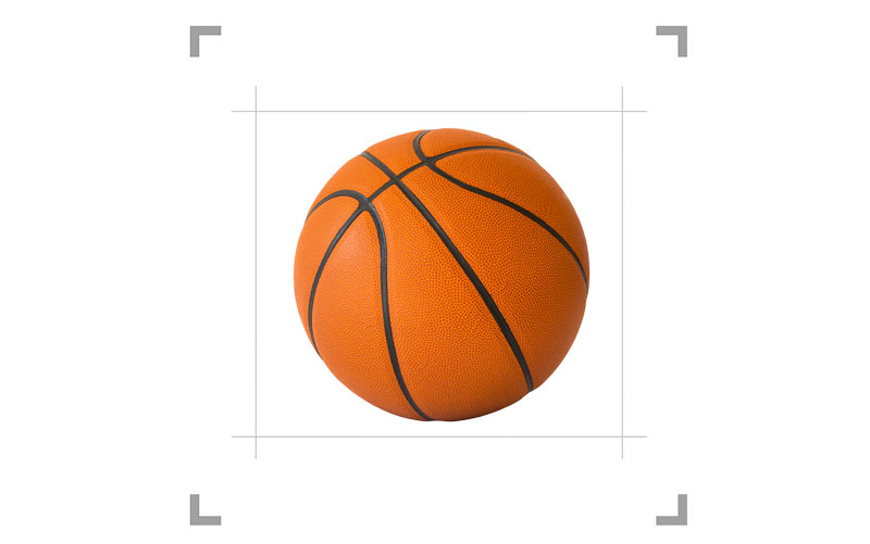
Pro tip: Investing in a camera tripod helps you make every photo look the same (and don't forget to mark where you place the product with tape).
6. Remove any background
Removing the background of your product images gives your eCom store a sleek, modern and consistent look across the board.
A plain background removes unwanted shadows or colors around the products and instantly makes your product photos look more professional. Plus, it puts your customers’ attention on what matters most—what you’re selling.

After editing your images, you’ll need to save them in .png format because it’s the only image file type that supports transparent backgrounds. The best way to know if your export worked is if your product is surrounded by grey and white squares. Those mean the background is transparent and will take on whatever color your site’s background is.

If this sounds like too many steps, Canva has a feature that will remove the background of any photo with one click.
7. Add reflections
Add product reflections to give them a luxurious appearance and add depth to your eCom store’s product photography. This is best achieved in post production or by using a small mirror. Mirrored surfaces complicate photography and you might spend hours trying to get your tripod out of the shot.
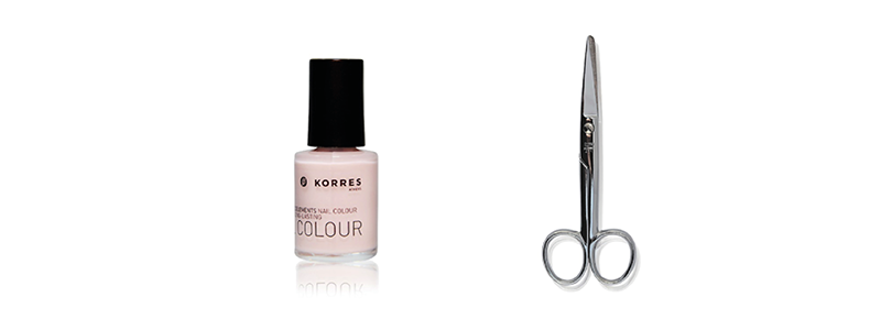
Pro tip: Only use reflection effects for product photos in the front-facing view like above. If the product image is more of a flat lay, there wouldn't naturally be a reflection. In that case, it's best to avoid reflections altogether.
8. Feature more than one image per product
Sometimes it’s best to showcase multiple images of each product. Customers want to see the product from different angles, close-ups of the product’s details and see how it looks on an actual human being.
eCom shoppers don’t have the same shopping experience as retail customers. They can’t try a product on. They can’t see all the details for themselves. You need enough images and product information (like size charts and outfit inspiration shots) to adequately showcase the product.
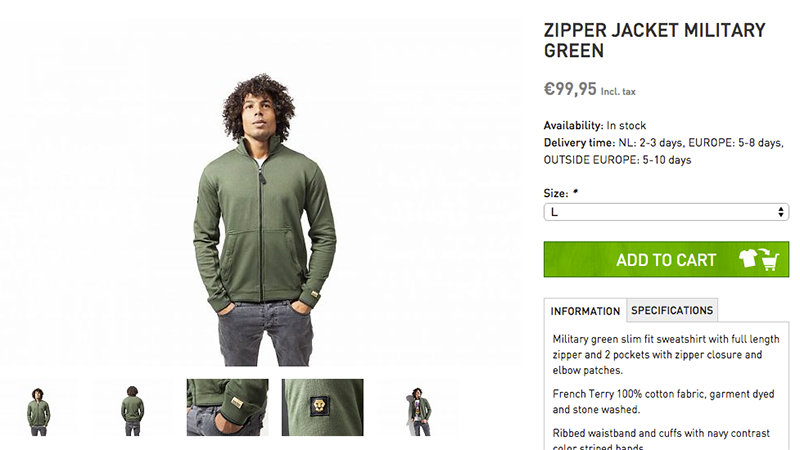
Pro tip: If you're going to use a model for your eCom shoots, we recommend mentioning the model's height and what size they're wearing. It helps customers visualize how the product will fit on them.
9. Watermark your images
You’re investing a lot of time into your eCom store’s product photography. Consider watermarking your product photos to prevent people who sell the same (or similar) products from using your photos without permission.
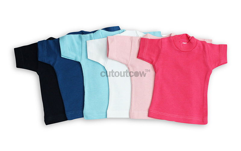
If you decide to watermark your product photos, consider making it discrete. You still want the focus to be on the product, not on a prominently featured watermark like the one below.
10. Showcase each product color
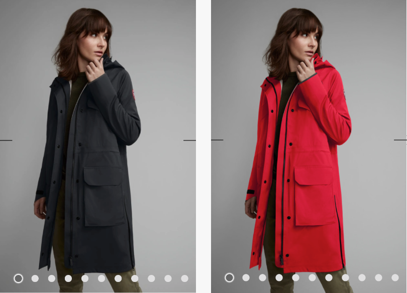
If you offer a product in multiple colors, make sure you have photos of each color on your site. If your customers order more than one color, you increase your cart size and average order value.
You don’t need to take more than one product photo for multiple color variations. If you know how to use photo editing software, you can take one great photo and change the color using photo editing software like Canada Goose did for their parka below.
Your eCom product photography makes a big difference
The photos you use on your eCom store are one of your greatest assets. When done well, they’ll improve your customers’ online shopping experience, and increase your site conversions and average shopping cart value. When done poorly, they do the exact opposite and can hurt your brand.
If you’re looking for time-saving tools to run your eCommerce website, talk to one of our experts to learn how Lightspeed can help.

News you care about. Tips you can use.
Everything your business needs to grow, delivered straight to your inbox.


