
Picture this: you’re out shopping, and you have time for one more stop. There are two stores in front of you. One hasn’t put much time into their boutique design—they’re all white racks and plain walls. The other has a brand identity you can clearly see just from the window display, with a welcoming atmosphere and lots of comfy places to sit down.
Which store are you choosing?
Transforming your retail space into a captivating boutique is not just about selling products. It’s about creating an immersive brand experience that resonates with every visitor. With the right design ideas, your boutique can become a reflection of your brand’s identity, inviting customers into a world where every detail speaks to the heart of what you stand for.
We’ll go over boutique design ideas for:
- Using color and art
- An immersive ambience
- Lighting techniques
- Customer comfort
- Gram-worthy stores
- Technology and design
- Sustainability
- Promoting your community
- Visual merchandising
- Window displays
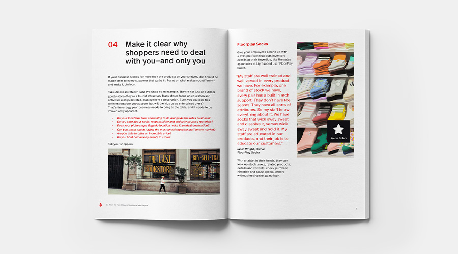
11 ways to turn window shoppers into buyers
From merchandising to being seen as an advisor, how you approach customers and what sort of image you present is more critical to your business than ever. In this free downloadable guide, you’ll find tips on building a relationship with window shoppers and making a lasting impression from their first visit.
Showcase your brand
Here’s the thing: if there was one way to design a boutique, every boutique would look the same.
But they don’t, do they? Even boutiques that follow similar design principles will look unique when they incorporate their brand into every design decision they make.
Every element of your retail space—from the decor and lighting to the layout and product presentation—should resonate with the core essence of your brand.
Think about these points as create a cohesive brand experience through design elements:
- Make sure you have a consistent color scheme and visuals: choose a color palette and visual elements that reflect your brand’s personality and values. Consistency in these elements across all touchpoints, from the interior design of your boutique to your packaging and online presence, creates a recognizable and memorable brand experience.
- Design a strategic layout: design your boutique’s layout to guide the customer journey in a way that reflects your brand’s narrative. Consider how each area of the space can tell a part of your brand’s story, from the entrance to the checkout. A well-thought-out layout that facilitates easy navigation and showcases your products effectively can enhance the overall shopping experience, making it more enjoyable and aligned with your brand values.
- Include personalized details and storytelling: incorporate elements that tell your brand’s story and convey its values. This could be through artwork, decor, music or even scent. Personal touches that speak to the heart of your brand can create a deeper sense of connection and belonging for your customers.
Use color and art to create a welcoming ambiance
Almost all—up to 90%—of customers judge a store within 90 seconds, solely based on color. Make sure you’re deliberate in your choices so you make a positive first impression.
If it makes sense for your store, opt for warm, neutral tones or soft, welcoming hues that make the space feel cozy and comfortable. If your brand is more about bright colors and bold statements, balance them with white accents to give the eye a place to rest.
Furniture should not only complement the boutique’s aesthetic but also encourage lingering in the store. Think seating areas and accessible product displays that invite touch and interaction.
Art choices play a pivotal role in setting the tone—select pieces that reflect the brand’s identity and add a personal touch, making the space feel curated and special.
The entryway is your first opportunity to make a lasting impression, so put it all together there. Design it to be open and welcoming, with clear signage in your chosen colors. Consider a statement piece, like a unique piece of art or a beautifully arranged display of your products, to draw customers in.
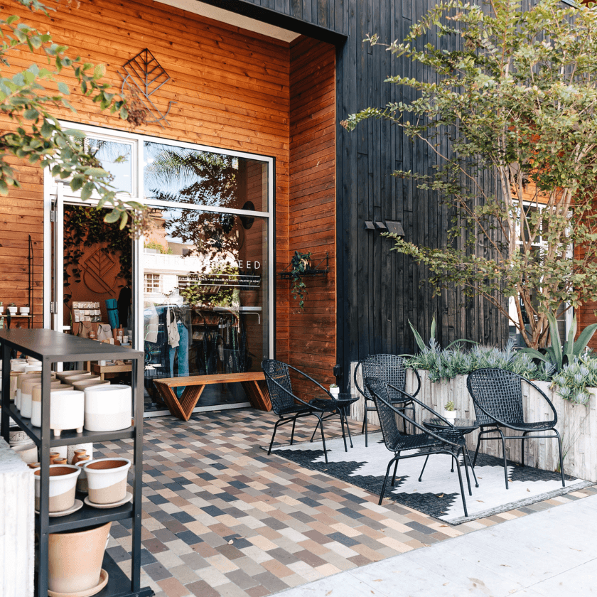
Fashion boutique Thread + Seed takes advantage of their native California’s warm weather to bring their entryway design outdoors, inviting passers-by to stop, sit and consider products before they’re even in the store.
Expand on your ambience with sensory design strategies
Make your boutique an engaging place to be by appealing to your customers’ senses of touch, sound and smell as well as sight.
Select materials and finishes that encourage tactile interaction (while being easy to clean, what with all that touching). Choose textures that invite customers to touch and engage with the environment, such as soft textiles, smooth wood or textured stone.
Integrate ambient sounds and scents to further complement the store’s design theme. For a boutique with a natural theme, the sound of flowing water or forest ambiance paired with earthy scents can transport customers to a tranquil setting. A more avant-garde boutique might benefit more from futuristic sounds and a clean, minimalist scent, whereas a vintage clothing store could clash with these choices.
Ambient sounds and scents should be subtle, enhancing rather than overwhelming the shopping experience. You want to immerse your customers, not drive them away.
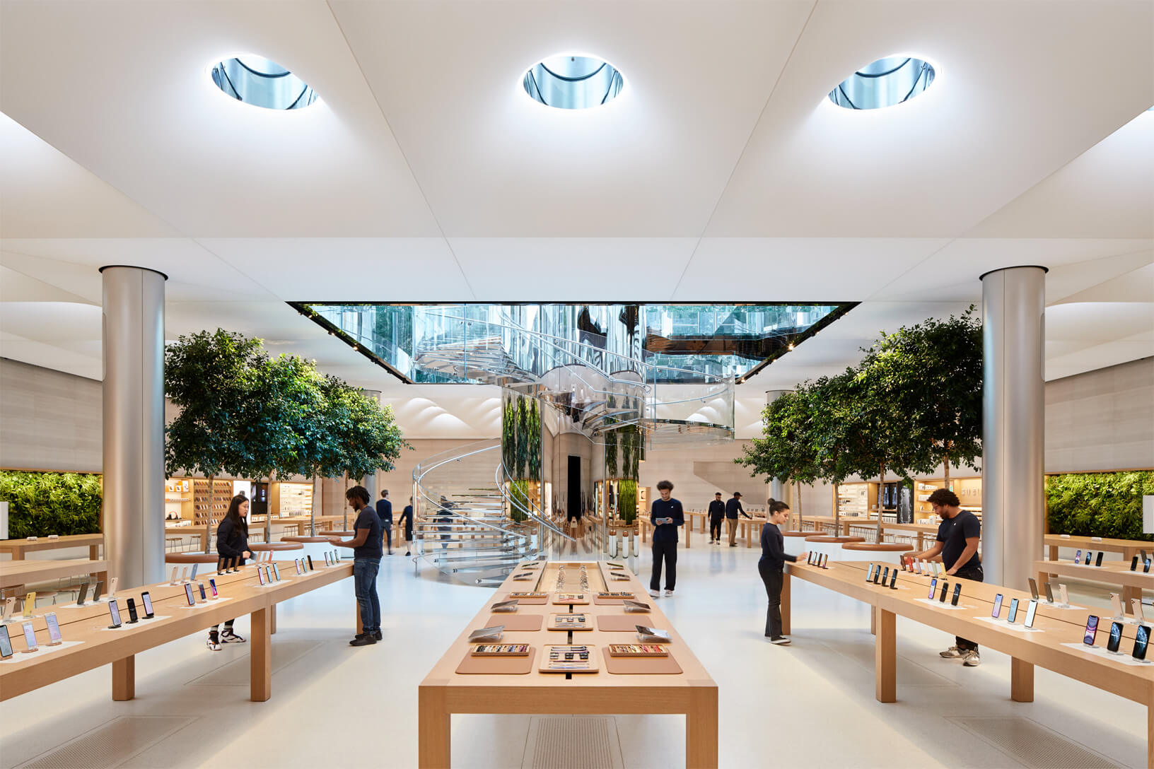
Consider Apple. Apple’s stores feature clean, tech-focused ambience with subtle background music to convey an upscale, modern aesthetic. They decorate their boutiques with materials that encourage tactile interaction, such as wooden tables and smooth metal finishes.
Don’t forget about lighting techniques
Lighting plays a pivotal role in shaping the atmosphere and enriching the shopping experience. It sets the mood, highlights products and can even influence customer behavior. One study found that soft light led to more positive experiences in store, and another found that dressing rooms should have frontal lights instead of overhead lighting.
When decorating your boutique, focus more on soft, diffused lighting instead of bright overhead lights. This will help you create a warm, welcoming environment that encourages customers to relax and spend more time exploring. It’s perfect for creating an ambiance that complements the overall design aesthetic and enhances the comfort level of the space.
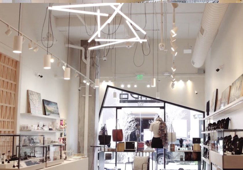
If you do opt for overhead lighting, make it visually interesting, like LIMBO has—their lighting acts almost as another art piece in the boutique.
Natural lighting is a valuable asset that can make a boutique feel more open and inviting. When possible, maximizing natural light can improve the overall mood, make colors appear more true to life and even reduce energy consumption. Large windows or skylights can flood the space with daylight, blending seamlessly with artificial lighting to create a balanced, appealing environment. Proper use of natural light can also connect the indoor space with the outdoor environment, making the boutique feel larger and more vibrant.
Save direct lighting for spotlighting specific merchandise or areas, making them the focal point and drawing customer attention to high-priority items. This type of lighting is ideal for showcasing premium products or creating contrast in certain sections of the store.
Find ways to improve customer comfort
Creating a comfortable and convenient shopping environment is crucial for enhancing customer satisfaction and encouraging longer visits, which can lead to increased sales.
How you create comfort will differ depending on your ideal customer profile.
For example, if you tend towards younger shoppers, incorporating modern conveniences such as charging stations offers a nod to their tech-savvy generation. Placing these stations strategically throughout the boutique allows customers to recharge their devices while they shop, blending the digital and physical shopping experiences seamlessly. This modern touch not only meets a practical need but also encourages customers to linger longer within the space.
Or it may be the case that leaning into an upscale, relaxing atmosphere is right for your customer. Focus on creating serene seating areas around the store to cater to these sensibilities. Lush seating areas serve as tranquil havens where customers can relax, reflect on their potential purchases or simply take a break. Adding plush seating, calming decor and perhaps even a selection of books or magazines can transform shopping from a task into a leisurely experience.
Both of these strategies aim to make the shopping environment more inviting and accommodating. They cater to different customer needs and preferences, but can be combined based on who you’re looking to serve in your stores.
Create social media-friendly store sections
When your store is snap-worthy, you’ll end up on social media without having to do all the posting yourself.
Try utilizing visual elements that are both eye-catching and shareable on social media, while maintaining uniqueness. Creating Instagrammable moments throughout the store encourages customers to become brand ambassadors, sharing their experiences with a wider audience.
Here are some ideas:
- Integrate bold design features that stand out, such as vibrant murals, quirky art installations or interactive displays. Hire local artists to do the work for a bit of mutual promotion and community building.
- Switch up your displays seasonally. Eye-catching, thematic decor that changes seasonally or around specific themes can also encourage repeat visits and social media shares.
- Make use of decorative lighting to create a selfie station where your brand’s logo, motto or theme are emblazoned in the background in neon light.
Consider how Lightspeed user CBD Kratom uses neon lights and wallpaper to add a simple selfie-worthy wall to one of their stores.
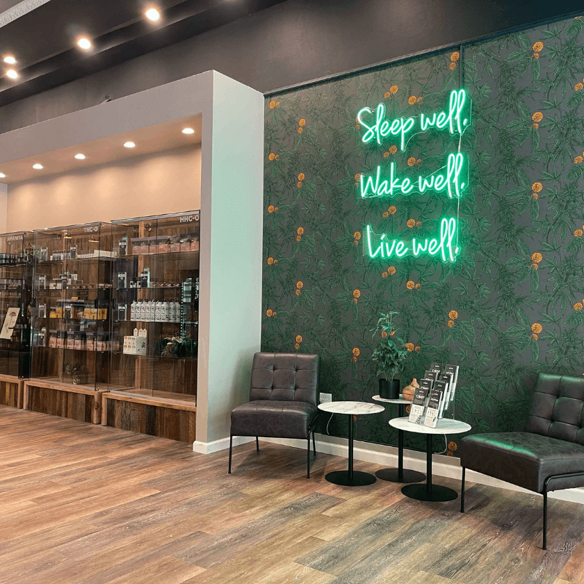
Incorporating these shareable moments into your boutique design transforms the shopping experience into a memorable, photo-worthy event that customers are eager to share, driving organic engagement and attracting a broader audience to the boutique.
Integrate technology into your design
Integrating technology into a boutique setting can significantly elevate the customer experience by blending convenience with a personalized touch.
Modern POS systems can also provide valuable insights into customer preferences and purchase history, allowing for a tailored shopping experience with personalized recommendations and promotions. Plus, they look good—an iPad POS system on a simple, classy stand at the checkout counter cuts down on clutter.
Digital pricing signs are another innovative technology that can transform the retail environment.
These dynamic displays allow for quick updates and adjustments to pricing, ensuring accuracy and transparency. They also let you show off product reviews and ratings, making it easier for customers to make a purchase decision.
Incorporate sustainability and eco-friendly design
Most customers (78% of them in one survey) find sustainability very, very important in their shopping journey. That means you should stock sustainable products, obviously, but it also means your boutique design should be eco-friendly.
Consider embracing thrifted and recycled furniture, not only as a cost-effective solution but also as a statement of commitment to sustainability. These pieces add unique charm and character while reducing waste. DIY design elements further personalize the space and demonstrate creativity and resourcefulness, often utilizing repurposed materials for fixtures and decor.
To avoid wasteful design, steer clear of single-use decor, excessive packaging and non-recyclable materials. Overly trendy designs that require frequent updates also contribute to waste; instead, go for timeless aesthetics with the flexibility for minor updates.
Here are some tips for creating an eco-friendly boutique environment:
- Use LED lighting: opt for energy-efficient LED lighting to reduce energy consumption and minimize your carbon footprint.
- Incorporate living plants: add indoor plants to improve air quality and bring a touch of nature into your boutique, enhancing the overall ambiance.
- Select sustainable materials: choose furnishings and decor made from recycled, reclaimed or sustainable materials to support environmentally responsible practices.
- Minimize packaging waste: Offer products with minimal packaging or packaging made from recycled materials, and encourage reusable bags to reduce waste. You can sell your own reusable branded bags to cut down on waste and spread your brand wherever your customers go.
Promote a sense of community in your retail space
Incorporate flexible display areas and movable furniture into your design to facilitate the hosting of events, workshops or pop-ups.
These elements can be easily reconfigured to create open spaces for gatherings or intimate settings for personalized shopping experiences. Such design choices not only maximize the utility of the space but also create opportunities for the boutique to serve as a community hub, where customers can connect with each other and the brand on a deeper level.
When you’re holding an event, decorate themes that reflect the boutique’s identity and values can further enhance the sense of community and belonging. The goal is to create an inviting atmosphere that encourages participation, fosters connections, and leaves a lasting impression on customers, making them more likely to return and engage with the brand.
Step up your visual merchandising
Visual merchandising is the art of displaying products in a way that enhances their appeal and encourages customer engagement. The goal is to attract customers’ attention and tell a compelling product story.
While designing your boutique, go beyond simple shelves. Well-executed displays can significantly influence buying behavior, guiding customers through the store and drawing their attention to specific products or promotions. This not only encourages immediate purchases but also fosters loyalty, prompting customers to return.
Tips for creating visually appealing displays that highlight products effectively:
- Leverage lighting to enhance product features: strategic lighting can dramatically enhance the appeal of your products. Use a mix of ambient, task and accent lighting to draw attention to specific items and create a mood that complements your merchandise.
- Create thematic displays for storytelling: design your displays around themes that resonate with your brand and connect with your customers’ interests. Use props, color schemes and layout variations to reinforce the theme and give context to the products, making them more desirable.
- Incorporate levels and depth: Arrange products at varying heights and depths to create a dynamic and visually interesting display. Using shelves, risers or platforms to elevate items can add an element of intrigue and encourage customers to take a closer look.
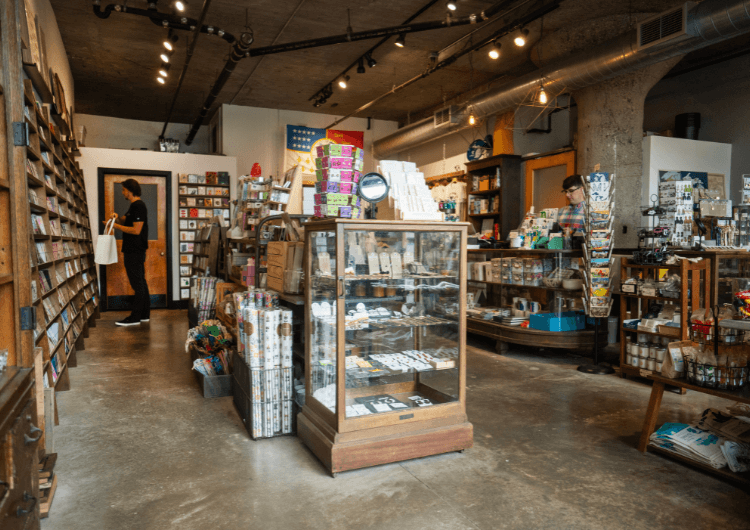
Detroit-based gift boutique City Bird uses flat vertical shelves, display racks and antique cases to showcase merchandise with depth while staying true to their warm, welcoming brand.
Top it all off with dynamic window displays
Once you’ve got your boutique designed, take a minute to consider your window displays. Your window shouldn’t be static (it should change at least seasonally) but it should have a defined visual language that reflects your brand.
Consider creating a guide that outlines your brand’s colors, shapes, textures and vibes—are you a pastel-colored brand with lots of curved shapes and luxurious silk reflecting expensive spa days, or are you a dark earth-toned brand with organic shapes, plants and leather couches reflective of a speakeasy?
The key is to create a narrative that resonates with your brand identity and visually communicates the essence of your retail space. Using your brand guidelines, pick bold, thematic elements that tell a story, integrating products with decorative items that reflect the interior’s design and ethos. Lighting plays a crucial role, highlighting key pieces and creating depth.
Window displays should be refreshed regularly to maintain interest and reflect the dynamic nature of your brand. A good rule of thumb is to change them with the seasons and major holidays or to coincide with new product launches, ensuring the storefront remains fresh, relevant and engaging throughout the year. This not only attracts new customers but also encourages repeat visits, as the window display becomes a continuously evolving showcase of your boutique’s unique identity and creativity.
Tie your boutique together with your brand
Designing your boutique is more than just aesthetics. It’s about crafting a space that tells your brand’s story and connects with customers on a personal level.
Integrating these boutique design ideas can help you create an environment that’s not only visually appealing but also emotionally engaging. Remember, the goal is to offer an experience that customers can’t find anywhere else so they see your boutique not as just a store, but a destination.
On the hunt for the perfectly stylish POS system to top off your boutique design? We can help. Watch a demo and see what Lightspeed can do.
Frequently asked questions about fashion boutique design
How do I design my boutique?
When you’re designing your boutique, start by gathering inspiration on sites like Pinterest. Once you have a good idea of the direction you want to go in, try downloading 3D home builder software to mock up ideas. Take your inspiration and your mockups to furniture stores to talk to experts and guide your purchases.
What is a boutique style layout?
A boutique style layout is intimate and curated, often featuring open spaces that encourage exploration, with distinct zones or thematic areas for different product types. It emphasizes personalized experiences, with products displayed in accessible, attractive arrangements that invite interaction.
How should a boutique look?
Design your boutique by aligning the interior with your brand identity, choosing a color scheme and decor that reflect your ethos. Incorporate unique, eye-catching displays, comfortable browsing spaces and interactive elements to enhance customer engagement. Prioritize soft lighting and an open layout with places to rest for a welcoming atmosphere.
How can I create a cohesive brand experience through design elements?
Create a cohesive brand experience by consistently applying your brand’s color scheme, logos and visual motifs throughout the design elements. Use signage, packaging and decor that reinforce your brand identity, ensuring a seamless perception from the storefront to the website.
What are some practical tips for maximizing limited retail space?
Maximize limited retail space by using multi-functional furniture, vertical displays and strategic lighting to create a sense of openness.
Optimize your layout for flow and convenience, employing mirrors to visually expand the space and carefully curating merchandise to avoid clutter.
How can lighting be used to enhance the shopping experience?
Lighting can enhance the shopping experience by creating ambiance, highlighting products, and guiding customers through the boutique. Use a mix of ambient, task and accent lighting to emphasize key areas, draw attention to merchandise and set the mood. Make sure lights in dressing rooms are forward-facing, not overhead.
What are some ways to incorporate technology into a boutique setting?
Incorporate technology by implementing advanced POS systems for smoother transactions, using digital displays for dynamic pricing and information and offering free Wi-Fi and charging stations to improve the overall customer experience.
How can I create a sustainable and eco-friendly boutique environment?
Create a sustainable and eco-friendly boutique environment by using recycled or renewable materials for fixtures and finishes, incorporating energy-efficient lighting, minimizing waste through reusable packaging and selecting products that adhere to ethical and environmental standards. Insulate your windows to control indoor temperatures and cut down on heating emissions. If you offer perks like snacks and beverages, opt for reusable mugs, cups and plates instead of plastic or paper.

News you care about. Tips you can use.
Everything your business needs to grow, delivered straight to your inbox.


