At Lightspeed, as we continuously work toward improving our products, some questions always remain top of mind. What should we focus on? What do our customers need? Where do we start? And most importantly, how do we know we are tackling the right problem?
Great tech companies around the world are no strangers to these questions. In fact, Google designer Jake Knapp joined Braden Kowitz and John Zeratsky at Google Ventures to develop a path through various problems for companies in mobility, eCommerce, healthcare, finance and more. They called it “The Design Sprint”.
At Lightspeed, we decided to take a page from their book and give it a shot. We took the Google Design Sprint as guidance and gave it our own spin by dedicating 10 days instead of 5.
The Team
The team consisted of:
- 1 Designer (Maarten Afink)
- 2 Back-End Developers (Cristina Antonie & Vincent Cohen)
- 1 Front-End Developer (Ahmed Gabri)
- 1 QA Tester (Lisa van der Werf)
- 1 Project Manager (Kasey Tu)
- 1 Product Manager (Daryl Timmerman)
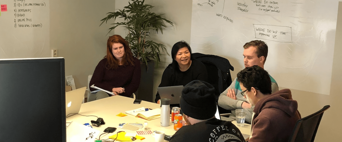
For two weeks, we locked ourselves in a room with the goal of finding a pain point within our product, coming up with its solution, and building it out by the end of it. Here’s a quick recap of how it went:
Day 1
Our sprint started on a Wednesday morning at 10:00AM. Phones, laptops, tablets and even our monitors were all left outside the room or turned off — a very rare occasion at Lightspeed. It was time to focus and come up with a problem area we would focus on.
Internal stakeholders, like our customer support and onboarding teams, were interviewed to find the right problem area. Our onboarding team is the first touchpoint our merchants have when they start using our products. They are in the best position to guide us when discussing the problems merchants are facing as they start to set up their stores.
On the other hand, our customer support team would have more knowledge on problem areas our longer-term merchants are facing when managing their stores. We asked them several questions to figure out what the most common problems were, and it didn’t take long before the Product Page stood out as a main pain point.
One statement in particular stood out:
“Customers always ask us if they provided enough information in their Product Page, as there are so many options. They never really have the feeling of being ‘Done’, which holds them back from moving on”.
We found this very interesting, not only because of merchants just starting out, but also for our existing merchants that will need to manage and add products on a daily basis.
We settled on working with the Product Page and by the end of the first day of brainstorming and interviewing our stakeholders our goals was set:
“To find a way to reinforce the feeling of being “done” after entering all product information.”
Day 2
We kicked off the day with a competitive analysis of competitor solutions that we believed faced the same problem we were trying to solve. By the end of the day, we combined our findings and started our preliminary sketches.
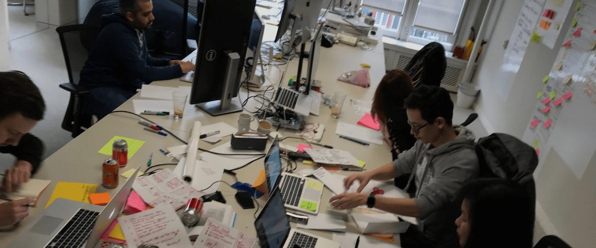
The Product Manager, QA tester, Developers and Designer all got to sketching in an exercise called ‘Crazy 8’s’, where each person has to sketch 8 distinct ideas in 8 minutes. One minute per sketch seemed almost impossible at first, but the outcome was amazing. The limited timeframe forces you to stick to what’s important.
We closed the day with a vote for the best ones we’d move forward with the next day.
Day 3
First thing on the agenda: fleshing out the winning ideas from the Crazy 8’s exercise. Then, from those winning ideas, another round of voting was conducted. It was up to our designer to create one final sketch to see if all of our ideas would fit nicely together.
Our stakeholders, customer support and onboarding teams were once again invited to give us another round of feedback on our final sketch. This time, any and every colleague in sight was asked to give their own feedback on the chosen solution. Great value was collected and the overall opinion was strongly in accordance to what we had heard so far.
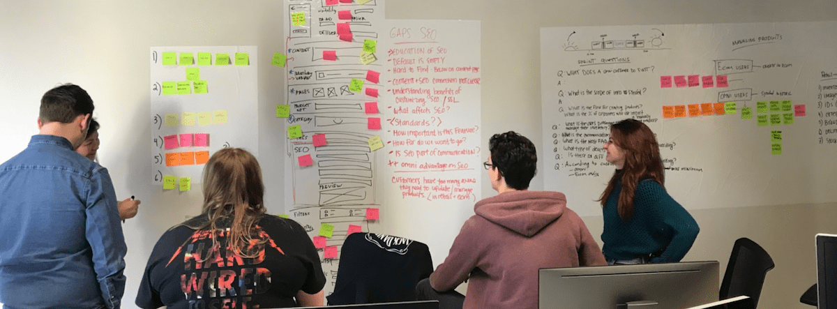
Up until this point, only internal stakeholders had been consulted. Although this brought us valuable feedback, the bottom line ‘test’ was just around the corner: showing our solution to a handful of our merchants. Luckily for us, a couple of merchants were visiting our office that same day. We invited them into our working space, which by then was covered in sketches, post its and all sorts of notes.
Another successful feedback session: our merchants liked what they saw. It was time to celebrate, as we were now sure we were on the right track.
Day 4
At this point, we’ve proven our ideas were spot on, and got positive feedback from our stakeholders and customers. Next step? Turn our solution sketches into an actual prototype.
Day 5-10
The last 5 days of the Design Sprint was finally time to build. The product manager wrote user stories, the designer continued working on optimization, the developers started coding and QA was ready to test.
By having all team members present at every stage of this process, we were able to make sure we stayed aligned every step of the way. This enabled us to keep moving fast and make quick decisions. The real value, however, was the involvement of stakeholders and merchants throughout every phase, as their feedback kept us on the right track.
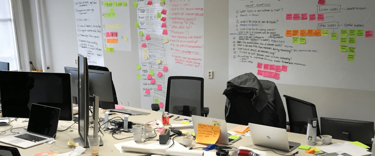
Then came day 10, and our team was finally finished. Satisfied of the end result, but rather sad that the sprint was over. A Design Sprint is quite the unique experience, and if you’ve ever been a part of one, you can imagine how satisfying it is to successfully complete a valuable addition to a product.
The new and improved product page
The goal was to find a way to reinforce the feeling of being “done” after entering all your product information. Currently, setting up products was taking a lot of time and took a lot of (sometimes unnecessary) scrolling through the product page. So, this is what we improved:
Overall order of the page
We rearranged existing sections and features on the product page so that the order in which you input the product information makes more hierarchical sense.
SEO Preview including SEO edit fields
SEO fields took up a lot of space before, so we decided to hide these fields in the SEO Preview section. In turn, we moved this section altogether to the top of the page so that you can instantly see the content auto populate as you enter information in neighbouring fields. As always, simply click the ‘edit’ button if any manual adjustments are needed.
![A design sprint and a new and improved product page | Lightspeed POS]() Regular SEO Preview on the Product Page
Regular SEO Preview on the Product Page
![A design sprint and a new and improved product page | Lightspeed POS]() Edit view of the SEO Preview on the Product Page
Edit view of the SEO Preview on the Product Page
Advanced Options based on user preference
Near the bottom of the page you’ll find ‘Advanced Options’. This section can be closed as not every merchant will use these, and not every product requires them. The ability to minimize this section provides users with a quick overview of the basic options they need to insert content into, without you having to worry about any advanced options.
This will be especially helpful for new merchants as they start entering all their products. Users can set their preferences in the back office as to whether they’d like that section to to appear or not.
Closed sections for Advanced Options
We really hope this new Product Page will save you a lot of time when either adding or managing your products. We are very proud of what we have achieved in just 10 days and we would like to thank everyone that was involved in getting this done.
You can expect an official release of this new user flow in October.
Want to sell online?
See why Lightspeed eCom is the best fit for your business

News you care about. Tips you can use.
Everything your business needs to grow, delivered straight to your inbox.
